Change-over-Time
Change-Over-Time
Change-over-time graphs illustrate how something has changed over the course of time.
Exemplar Change-Over-Time Data Visualization by David White-view on Tableau Public
Change-Over-Time
Change-over-time graphs illustrate how something has changed over the course of time.
My method:
First, I gather, clean up and plot the data. Then, I study the visualization I've created and I look for three things:
Are there any noticeable patterns in the data? (Looking at the data in a visual format really helps here. Data visualizations often reveal insights that would otherwise be hidden within a maze of numbers.)
Where are the highs and lows?
Is there anything shown in the data that is not what I expected to find?
The change-over-time graph is a tool that helps me ask better-informed follow-up questions. It helps guide me as I gather clarifying information and it helps me place that information into context. Let's say, for example, that after looking at a time series graph I notice that one particular point is much higher than all the others. I might ask "What else was happening on that day? What could have caused this to happen?"
Exemplar Change-Over-Time Data Visualization by David White
Correlation
Correlation
Correlation visualizations are graphs that show the relationship between two things.
Exemplar Correlation Data Visualization by David White-view on Tableau Public
Correlation
Correlation visualizations are graphs that show the relationship between two things.
My method:
First, I gather, clean up and plot the data. Then, I study the visualization I've created and I look for one of two things:
Is there a pattern where as one thing goes up, another thing also goes up?
-or-
Is there a pattern where as one thing goes up, another thing goes down?
When looking at a correlation visualization, if I don't find either of those things, it's a good bet that the two things I’m looking at are not in fact related to each other. (One is not affecting the other.) If I do find that there's a relationship between two things, then the question becomes “Did one of these things influence (or cause) the other?”
In any real-life scenario there are many, many things happening all at once. In these complex situations, my way of revealing the bigger picture is to put a spotlight on a pair of variables (just two specific things) at a time. Then I repeat that inquiry process until I’ve looked at the situation from every angle. Eventually, that uncovers the truth.
Exemplar Correlation Data Visualization by David White
Deviation
Deviation
Deviation visualizations are graphs that show how far above or how far below the average something is. They show how much something differs from what's normal.
Exemplar Deviation Data Visualization by David White-view on Tableau Public
Deviation
Deviation visualizations are graphs that show how far above or how far below the average something is. They show how much something differs from what's normal.
My method:
First, I gather, clean up and plot the data. Then, I study the visualization I've created and I look for two things:
Where is does the average fall? (What's considered "normal" for this set of information?)
Is there anything that stands out significantly from the average?
Here, I’m looking for anything that really stands out from the crowd. (It’s is much easier to gather this kind of insight from looking at a data visualization as opposed to just staring at a row of numbers on a spreadsheet.) If something does in fact stand out, then the question becomes "Why is this happening? What's going on with these individuals?” The deviation data tool helps me investigate what's really happening on a deeper level.
Exemplar Deviation Data Visualization by David White
Distribution
Distribution
Distribution visualizations are graphs that illustrate how frequently something occurs.
Exemplar Distribution Data Visualization by David White-view on Tableau Public
Distribution
Distribution visualizations are graphs that illustrate how frequently something occurs.
My method:
First, I gather, clean up and plot the data. Then, I study the visualization I've created and I look at the shape of the graph:
Let's say for example that I’m looking at a list of exam scores for a group of students. If the curve of the graph takes on a bell shape, that means everything is normal. (Nothing unexpected has occurred with on the exam.) If the curve of the graph leans to the left, that tells me that an unusually large number of students earned low exam scores. (Maybe the exam was unfair. Maybe some of the exam's topics need to be re-taught.) Conversely, if the graph leans to the right that means that an usually large number of students earned high exam scores. (Maybe the exam was not challenging enough. Maybe some students should be placed into an advanced class.)
The distribution graph helps me quickly identify when something is happening either more often or less often than one would normally expect. When looking at a distribution graph, we normally expect to see a bell-shaped curve. My attention is drawn to examples where the shape of the curve turns out not to be what we expected. In these cases the question then becomes “What’s causing this unusual situation to occur?”
Exemplar Distribution Data Visualization by David White
Flow
Flow
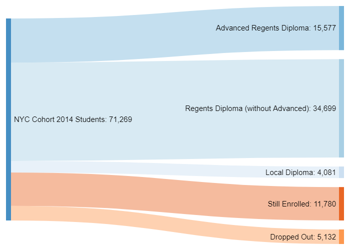
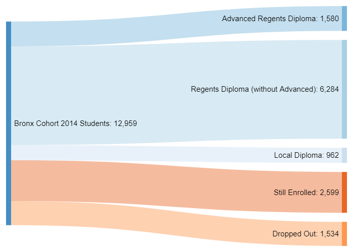
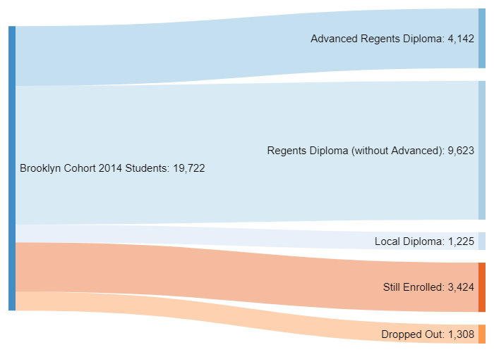
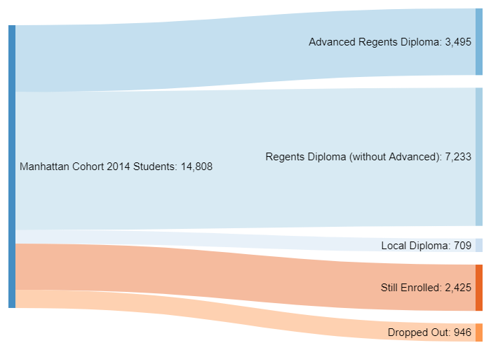
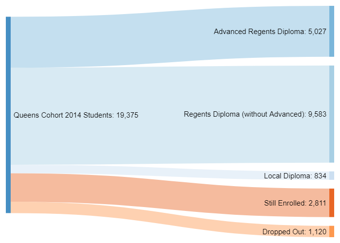
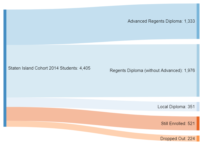
Flow charts illustrate movement through a cycle from start to finish. They’re similar to change-over-time visualizations except that they are typically used to describe a process that's repeated over and over again.
Flow
Flow charts illustrate movement through a cycle from start to finish. They’re similar to change-over-time visualizations except that they are typically used to describe a process that's repeated over and over again.
My method:
First, I gather, clean up and plot the data. Then, I study the visualization I've created and I look for two things:
Were there any noticeable changes from start to finish?
Did something change that I expected would stay the same? (Or vice versa?)
Exemplar Flow Data Visualization by David White
Magnitude
Magnitude
Magnitude visualizations are graphs which show the size of something as compared to the size of something else.
Exemplar Magnitude Data Visualization by David White-view on Tableau Public
Magnitude
Magnitude visualizations are graphs which show the size of something as compared to the size of something else.
My method:
First, I gather, clean up and plot the data. Then, I study the visualization I've created and I look for three things:
Is there anything shown in the data that is not what I expected to find?
Are there any big differences between the different things being measured? (Is one of them significantly bigger or smaller than the rest or are they all about the same size?)
Follow-up question: Why is this the case?
Magnitude graphs are useful because they allow me to visualize numerical information within context. That helps me discern the practical meaning of the numbers.
Exemplar Magnitude Data Visualization by David White
Part-to-Whole
Part-to-Whole
Part-to-whole visualizations are graphs that show how big an individual piece is as compared to the size of the whole.
Exemplar Part-to-Whole Data Visualization by David White-view on Tableau Public
Part-to-Whole
Part-to-whole visualizations are graphs that show how big an individual piece is as compared to the size of the whole.
My method:
First, I gather, clean up and plot the data. Then, I study the visualization I've created and I look for several things:
Is there any piece that takes up close to 100% of the whole?
Is there any piece that is very small and takes up close to 0% of the whole?
How many different different pieces are there in thing I’m looking at?
Do these pieces look like they form clusters or is each piece pretty much on its own?
If there are clusters, are all of them about the same size or are some much larger or smaller than others?
Is there anything shown in the data that is not what I expected to find?
Exemplar Part-to-Whole Data Visualization by David White
Ranking
Ranking
Ranking visualizations are graphs that show two things at once: (1) How much of something you have and (2) How that rates in comparison to how much others have.
Exemplar Ranking Data Visualization by David White-view on Tableau Public
Ranking
Ranking visualizations are graphs that show two things at once: (1) How much of something you have and (2) How that rates in comparison to how much others have.
My method:
First, I gather, clean up and plot the data. Then, I study the visualization I've created and initially I look for three things:
Who has the highest ranking?
Who has the lowest ranking?
Are there clusters of people who achieved similar results?
The answers to the first three questions typically lead to another set of questions to investigate and discuss with stakeholders:
What caused some scores to be high?
What caused others scores to be low?
What do the people with similar scores have in common?
What else could be going on that might be an influence on the results we're seeing?
Exemplar Ranking Data Visualization by David White
Spatial
Spatial
Spatial graphs are data visualizations that show two things at once: (1) How much of something there is and (2) Where in the world it's located.
Exemplar Spatial Data Visualization by David White-view on Tableau Public
Spatial
Spatial graphs are data visualizations that show two things at once: (1) How much of something there is and (2) Where in the world it's located.
My method:
First, I gather, clean up and plot the data. Then, I study the visualization I've created and I look for four things:
Are there any extremes in the data? (Is there anything that is very high or very low?)
Which places have similar results?
Follow-up question: What do these places have in common?
Is there anything shown in the data that is not what I expected to find?
Exemplar Spatial Data Visualization by David White
Display Tables
Display Tables
Display tables or graphic organizers, arrange text into a clear structure that helps people quickly and easily understand the information being shown to them.
Exemplar DisplayTable by David White-view on Tableau Public
Display Tables
Display tables or graphic organizers, arrange text into a clear structure that helps people quickly and easily understand the information being shown to them.
Here, my method is:
Determine what are the most important things about the data for stakeholders to know.
Think about what outside information someone would need to have in order to make sense of what the data is saying.
Present both of these in a format that is as clear and simple as possible.


