

Case Study 003. South Asian Youth Action (SAYA!) Attendance Tracker: Step 1
Step 1 - Discovery
To begin the process of creating the visualization, I met with the administrators of the intervention program and the mentors who worked directly with the students. I listened to the concerns they had and we talked about the challenges they were facing. I began to form an idea of what information needed to be included in the visualization and what raw data needed to be gathered.
SAYA Attendance Tracker: Work Process Step 1 of 5
Step 1 - Discovery
To begin the process of creating the visualization, I met with the administrators of the intervention program and the mentors who worked directly with the students. I listened to the concerns they had and we talked about the challenges they were facing. I began to form an idea of what information needed to be included in the visualization and what raw data needed to be gathered.

Case Study 003. South Asian Youth Action (SAYA!) Attendance Tracker: Step 2
Step 2 - Sketch
Next, I made a rough sketch of what the visualization would look like and what information would go where on the screen.
SAYA Attendance Tracker: Work Process Step 2 of 5
Step 2 - Sketch
Next, I made a rough sketch of what the visualization would look like and what information would go where on the screen.
Case Study 003. South Asian Youth Action (SAYA!) Attendance Tracker: Step 3
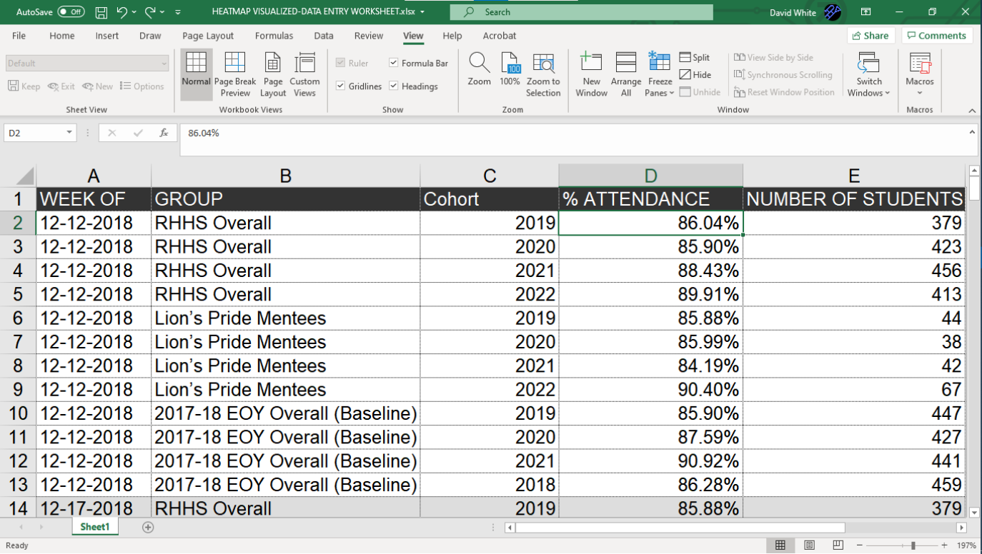
Step 3 - Prep Data
Since this was a visualization that would have to be updated on a weekly basis, I made sure to organize the data files in such a way that they could be updated quickly. I had to ensure that all of the columns for each category of data would line up exactly, every time. Also, since this would be a change-over-time visualization, it was important to make sure that the format for the date was exactly the same for every row of data. (In this case, I used “MM-DD-YYYY” format.)
SAYA Attendance Tracker: Work Process Step 3 of 5
Step 3 - Prep Data
Since this was a visualization that would have to be updated on a weekly basis, I made sure to organize the data files in such a way that they could be updated quickly. I had to ensure that all of the columns for each category of data would line up exactly, every time. Also, since this would be a change-over-time visualization, it was important to make sure that the format for the date was exactly the same for every row of data. (In this case, I used “MM-DD-YYYY” format.)

Case Study 003. South Asian Youth Action (SAYA!) Attendance Tracker: Step 4
Step 4 - Build
I built out the visualization using Tableau software. The final result would be projected on a large screen during the weekly meetings and I felt that Tableau was the the best choice for that type of presentation.
SAYA Attendance Tracker: Work Process Step 4 of 5
Step 4 - Build
I built out the visualization using Tableau software. The final result would be projected on a large screen during the weekly meetings and I felt that Tableau was the the best choice for that type of presentation.
Case Study 003. South Asian Youth Action (SAYA!) Attendance Tracker: Step 5
Step 5 - Publish
I published the finished visualization to Tableau online and I shared it with program administrators via secure link. At the weekly meetings, the visualization was projected on a large screen located at the front of the room. The visualization provided a common point of reference for the team and it was used to frame the conversations they were having about their shared work.
SAYA Attendance Tracker: Work Process Step 5 of 5
Step 5 - Publish
I published the finished visualization to Tableau online and I shared it with program administrators via secure link. At the weekly meetings, the visualization was projected on a large screen located at the front of the room. The visualization provided a common point of reference for the team and it was used to frame the conversations they were having about their shared work.