
Case Study 005. South Asian Youth Action (SAYA!) Weather vs. Attendance Tracker: Step 1
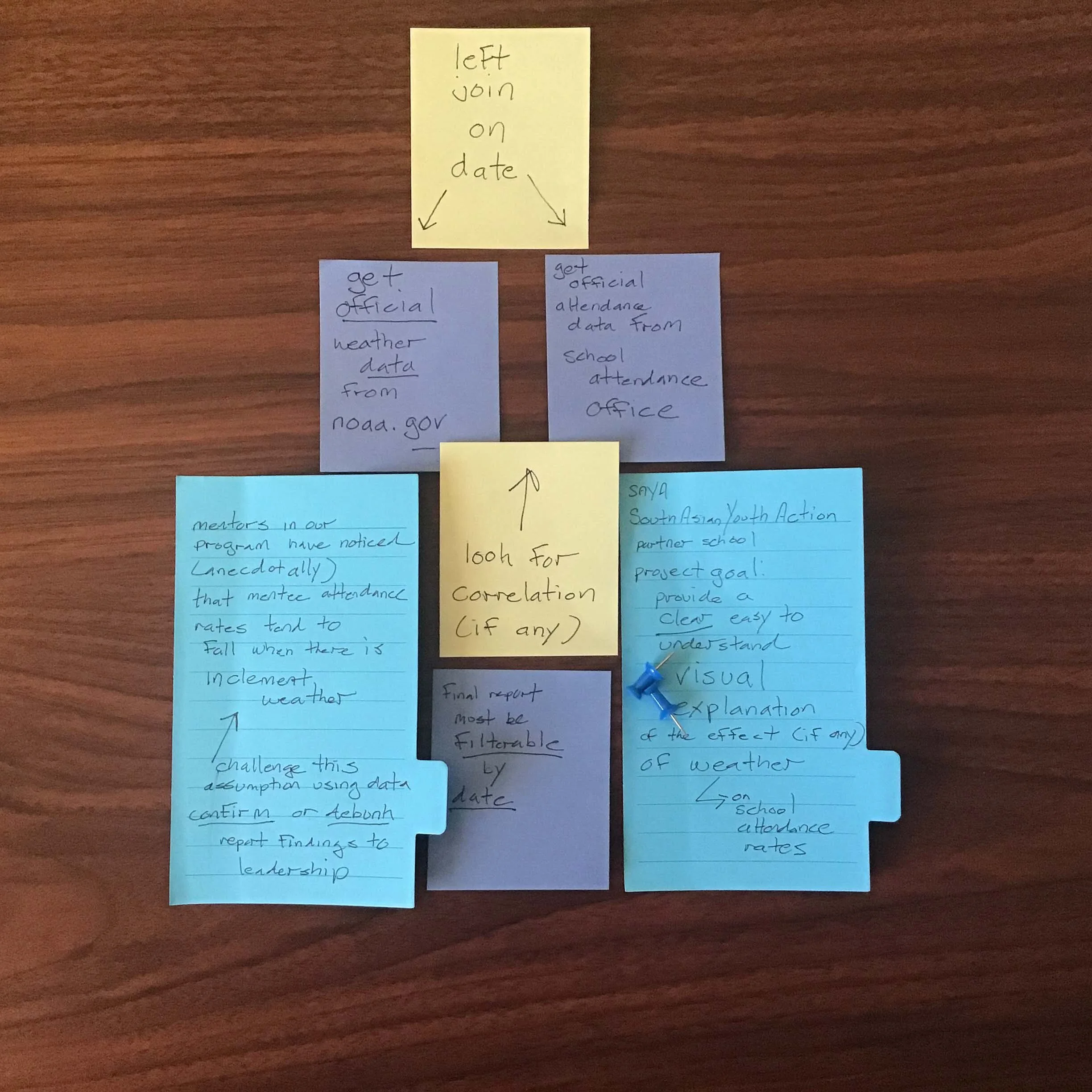
Step 1 - Discovery
To begin the process of creating the visualization, I met with the administrators of the intervention program and the mentors who worked directly with the students. I listened to the concerns they had and we talked about the challenges they were facing. I began to form an idea of what information needed to be included in the visualization and what raw data needed to be gathered.

SAYA Attendance vs. Weather: Work Process Step 1 of 5
Step 1 - Discovery
To begin the process of creating the visualization, I met with the administrators of the intervention program and the mentors who worked directly with the students. I listened to the concerns they had and we talked about the challenges they were facing. I began to form an idea of what information needed to be included in the visualization and what raw data needed to be gathered.

Case Study 005. South Asian Youth Action (SAYA!) Weather vs. Attendance Tracker: Step 2
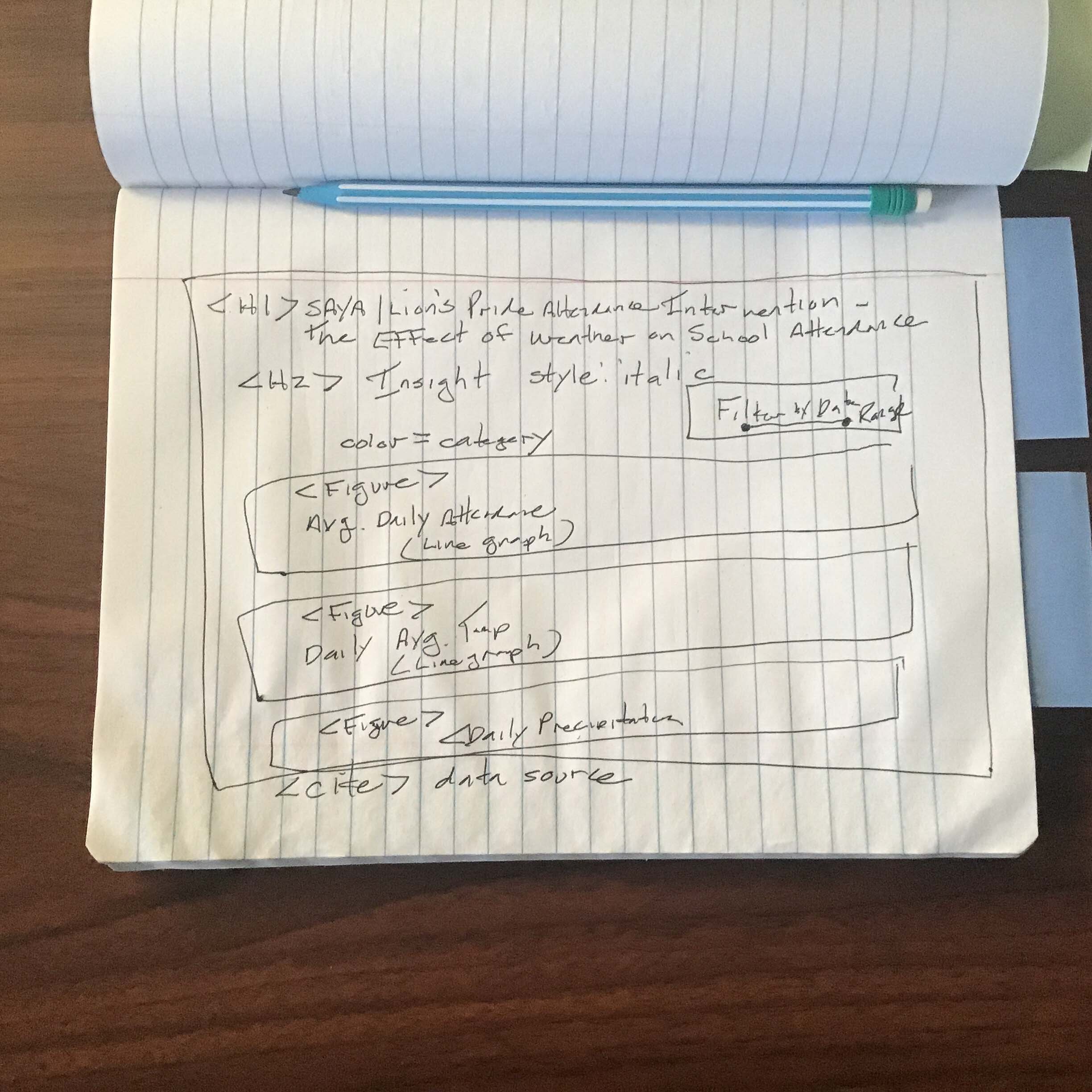
Step 2 - Sketch
Next, I made a rough sketch of what the visualization would look like and what information would go where on the screen.
SAYA Attendance vs. Weather: Work Process Step 2 of 5
Step 2 - Sketch
Next, I made a rough sketch of what the visualization would look like and what information would go where on the screen.

Case Study 005. South Asian Youth Action (SAYA!) Weather vs. Attendance Tracker: Step 3
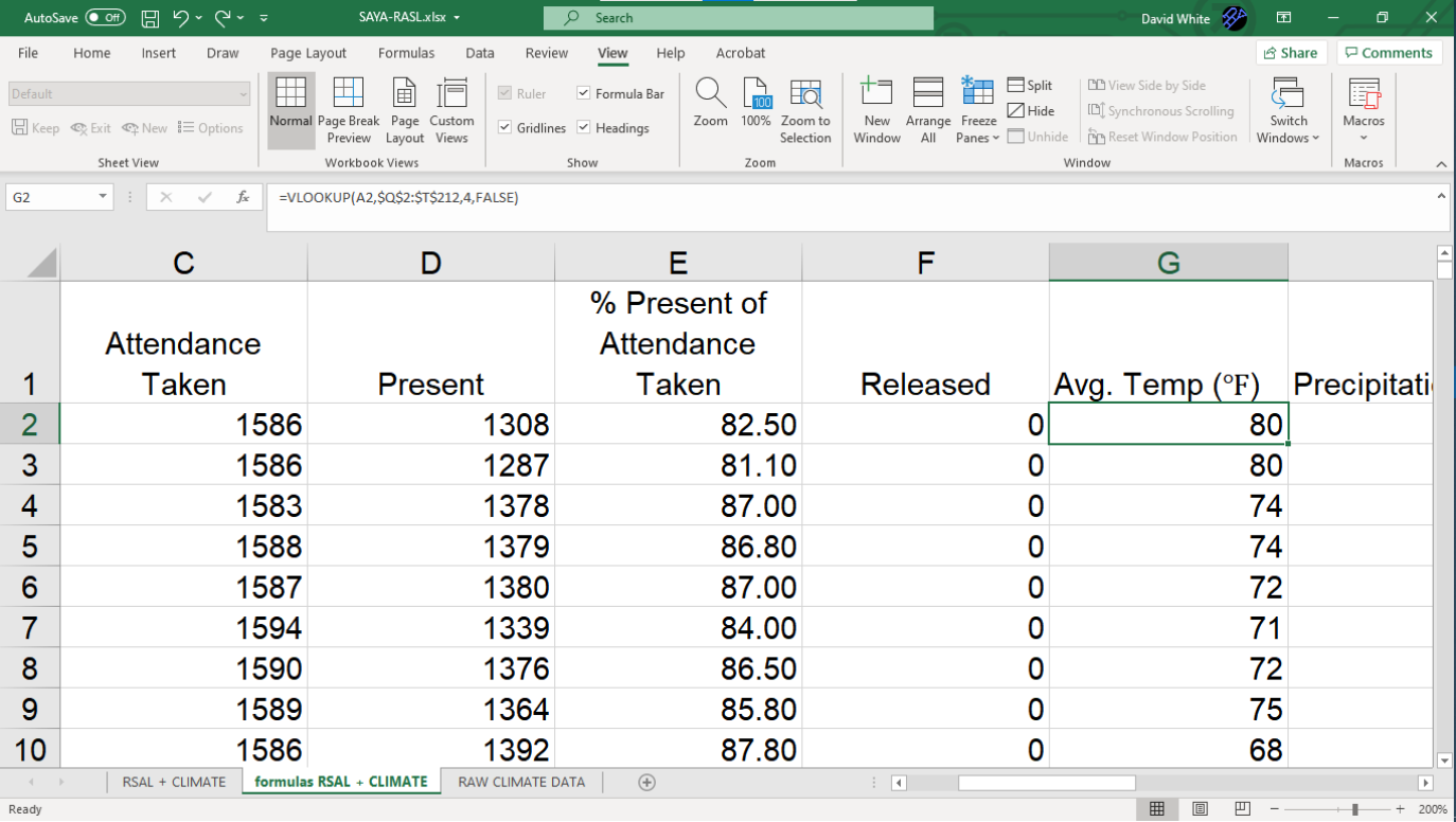
Step 3 - Prep Data
I collected the school’s attendance data and I joined it with local weather data published by the National Oceanic and Atmospheric Administration (NOAA). Then I lined up the daily attendance data with the NOAA weather data for that school day.
SAYA Attendance vs. Weather: Work Process Step 3 of 5
Step 3 - Prep Data
I collected the school’s attendance data and I joined it with local weather data published by the National Oceanic and Atmospheric Administration (NOAA). Then I lined up the daily attendance data with the NOAA weather data for that school day.

Case Study 005. South Asian Youth Action (SAYA!) Weather vs. Attendance Tracker: Step 4
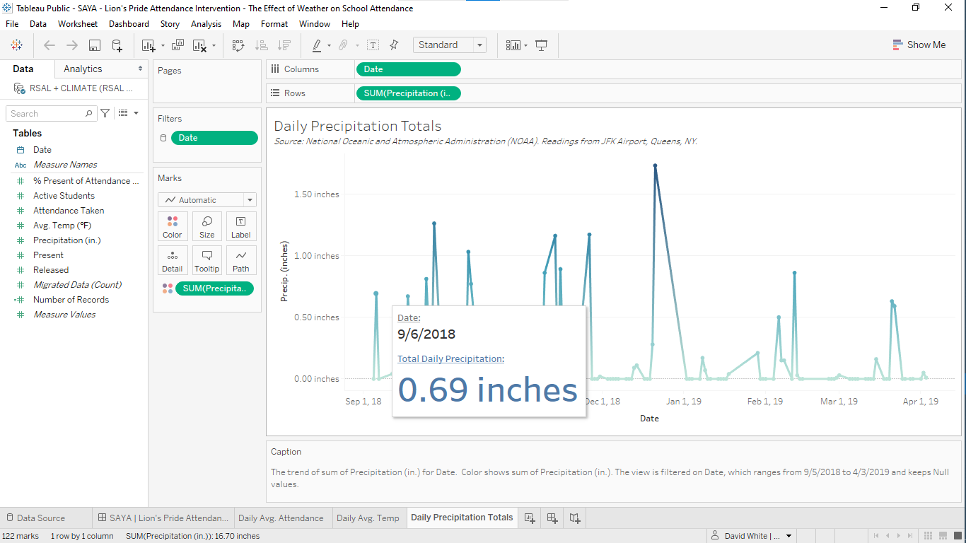
Step 4 - Build
I built out the visualization using Tableau software. The final result would be projected on a large screen during the team’s weekly meeting and I felt that Tableau was the the best choice for that type of presentation.
SAYA Attendance vs. Weather: Work Process Step 4 of 5
Step 4 - Build
I built out the visualization using Tableau software. The final result would be projected on a large screen during the team’s weekly meeting and I felt that Tableau was the the best choice for that type of presentation.

Case Study 005. South Asian Youth Action (SAYA!) Weather vs. Attendance Tracker: Step 5
Step 5 - Publish
I published the finished visualization to Tableau online and I shared it with program administrators via secure link. During the team meeting, the visualization was projected on a large screen locatd at the front of the room. The visualization provided a common point of reference for the mentors and it was used to frame the conversation about their intervention work.

SAYA Attendance vs. Weather: Work Process Step 5 of 5
Step 5 - Publish
I published the finished visualization to Tableau online and I shared it with program administrators via secure link. During the team meeting, the visualization was projected on a large screen locatd at the front of the room. The visualization provided a common point of reference for the mentors and it was used to frame the conversation about their intervention work.