

Sunday, July 25, 2021
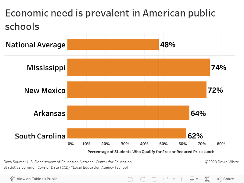
In public school reporting, “economic need” is defined by the percentage of students who qualify to receive a free or reduced price school lunch. The U.S. national average for economic need in public schools is 48%.…Read More
Insights, Made Fresh Daily
Economic Needs
48% of U.S. public school students qualify for free or reduced price lunch
David White | Sunday, July 25, 2021
This bar graph shows the rate of economic need of public schools in each state. In public school reporting, “economic need” is defined by the percentage of students who qualify to receive a free or reduced price school lunch. The U.S. national average for economic need in public schools is 48%. That figure is alarmingly high but what is more alarming is the fact that 19 states have economic need higher than 48%, the highest being Mississippi where 74% of all public school students qualify for free or reduced price lunch.
The underlying data was released by the U.S. Department of Education.

Thursday, July 22, 2021
NYC charter high school students rarely dropped out of school…Read More
Insights, Made Fresh Daily
Staying the Course
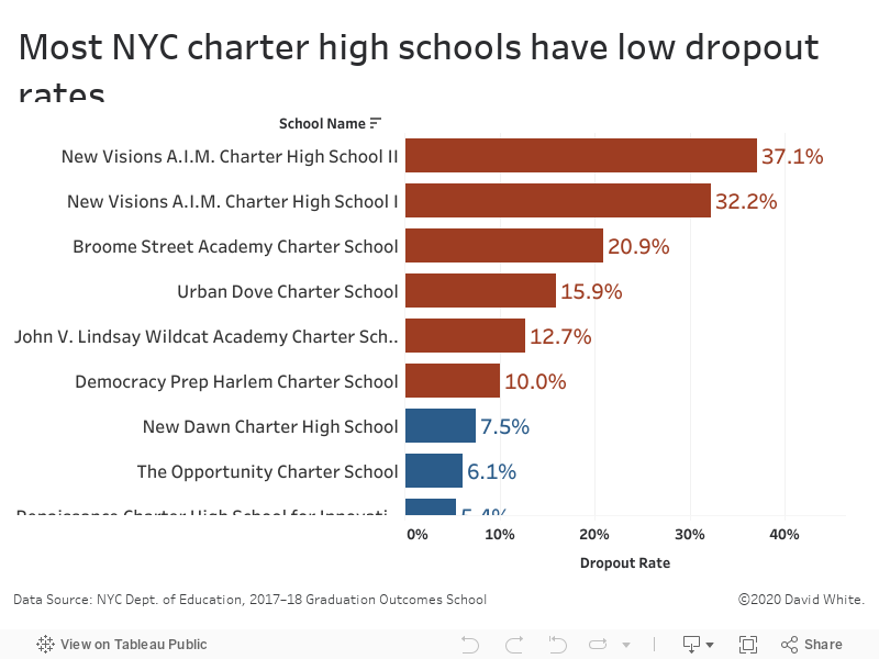
NYC charter high school students rarely dropped out of school
David White | Thursday, July 22, 2021
This bar graph shows the 2017–18 dropout rates of each NYC charter high school. The underlying data was released by the City of New York.
A large majority of NYC charter high schools had a dropout rate of 7.5% or less. Only six schools had a dropout rate of 10% or more.
See also: MSM-E21. NYC charter graduation rates outpace the city average

Wednesday, July 21, 2021
NYC charters graduated seniors at a higher rate than the citywide average…Read More
Insights, Made Fresh Daily
Graduation Days
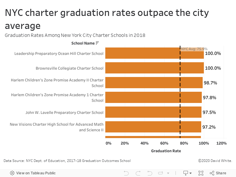
NYC charters graduated seniors at a higher rate than the citywide average
David White | Wednesday, July 21, 2021
This bar graph shows the 2017–18 graduation rates of each NYC charter high school. The underlying data was released by the City of New York.
In the 2017–18 academic year, the citywide graduation rate was 75.9%. A large majority of charter high schools outperformed the citywide average graduation rate.
See also: MSM-E22. Most NYC charter high schools have low dropout rates

Tuesday, July 20, 2021
Most NYC charter school graduates earned standard Regents diplomas…Read More

Insights, Made Fresh Daily
Advanced Diplomas
Most NYC charter school graduates earned standard Regents diplomas
David White | Tuesday, July 20, 2021
This bar graph shows a breakdown of the types of diplomas earned by NYC charter high school graduates in the 2017–18 academic year. The underlying data was released by the City of New York.
A large majority of NYC charter high school graduates earned standard Regents diplomas. Relatively few graduates earned local diplomas or Advanced Regents diplomas.

Monday, July 19, 2021
As literacy rises, so does income…Read More
Insights, Made Fresh Daily
Literacy vs. Income
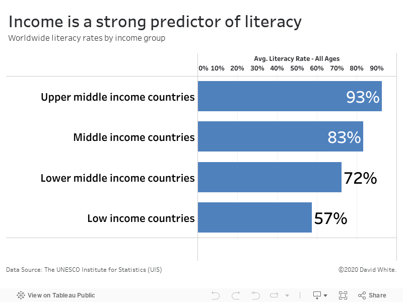
As literacy rises, so does income
David White | Monday, July 19, 2021
This bar graph illustrates the relationship between income and literacy rates among various countries. The underlying data was released by the United Nations.
It’s clear from the data that income correlates with a country’s literacy rate. Upper-middle income countries have a 93% literacy rate. In contrast, the literacy rate in low-middle income countries is only 57%.
Friday, July 16, 2021
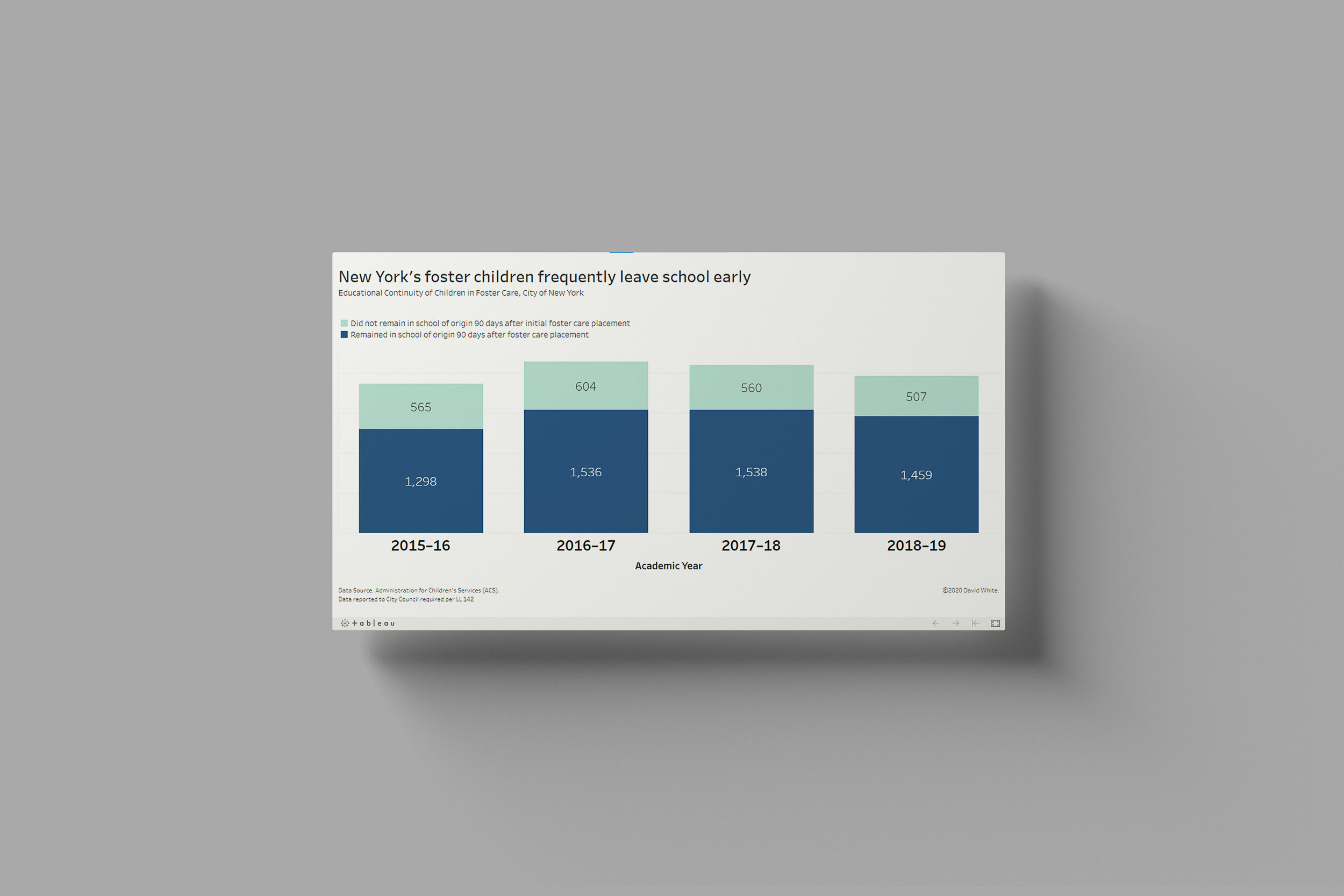
Forster children face significant challenges when it comes to schooling…Read More
Insights, Made Fresh Daily
Home & School
Forster children face significant challenges when it comes to schooling
David White | Friday, July 16, 2021
This bar chart illustrates the one of the many difficulties affecting foster children. Within 90 days of their initial foster care placement, a large number of children had already changed schools at least once. The underlying data was released by the City of New York.

Thursday, July 8, 2021
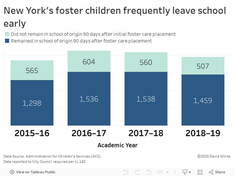
The NYC Department of Education accounted for more spending than any other city department…Read more
Insights, Made Fresh Daily
Tuition & Fees
The NYC Department of Education accounted for more spending than any other city department
David White | Thursday, July 8, 2021
This bar graph depicts the City of New York’s spending totals by department. The underlying data was released by the City of New York.
In Fiscal year 2018, the City of New York spent more than $2.5 billion on public education which was the most of any city department or agency. The next highest spending total was the Human Resources Administration with a total yearly budget of $990 million.

Tuesday, July 6, 2021
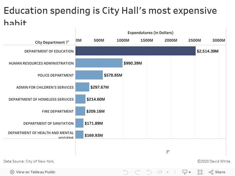
The City of New York has its sights set on some lofty goals…Read more
Insights, Made Fresh Daily
Higher Aspirations
The City of New York has its sights set on some lofty goals
David White | Tuesday, July 6, 2021
This dashboard shows goals that the government of the City of New York has set for various areas of public life. The underlying data was released by the City of New York.
The interactive data visualization outlines each of goals laid out in the OneNYC 2050 Strategic Plan along with the target numbers the city is trying to achieve and the dates by which they aim to achieve them.
Sunday, July 4, 2021
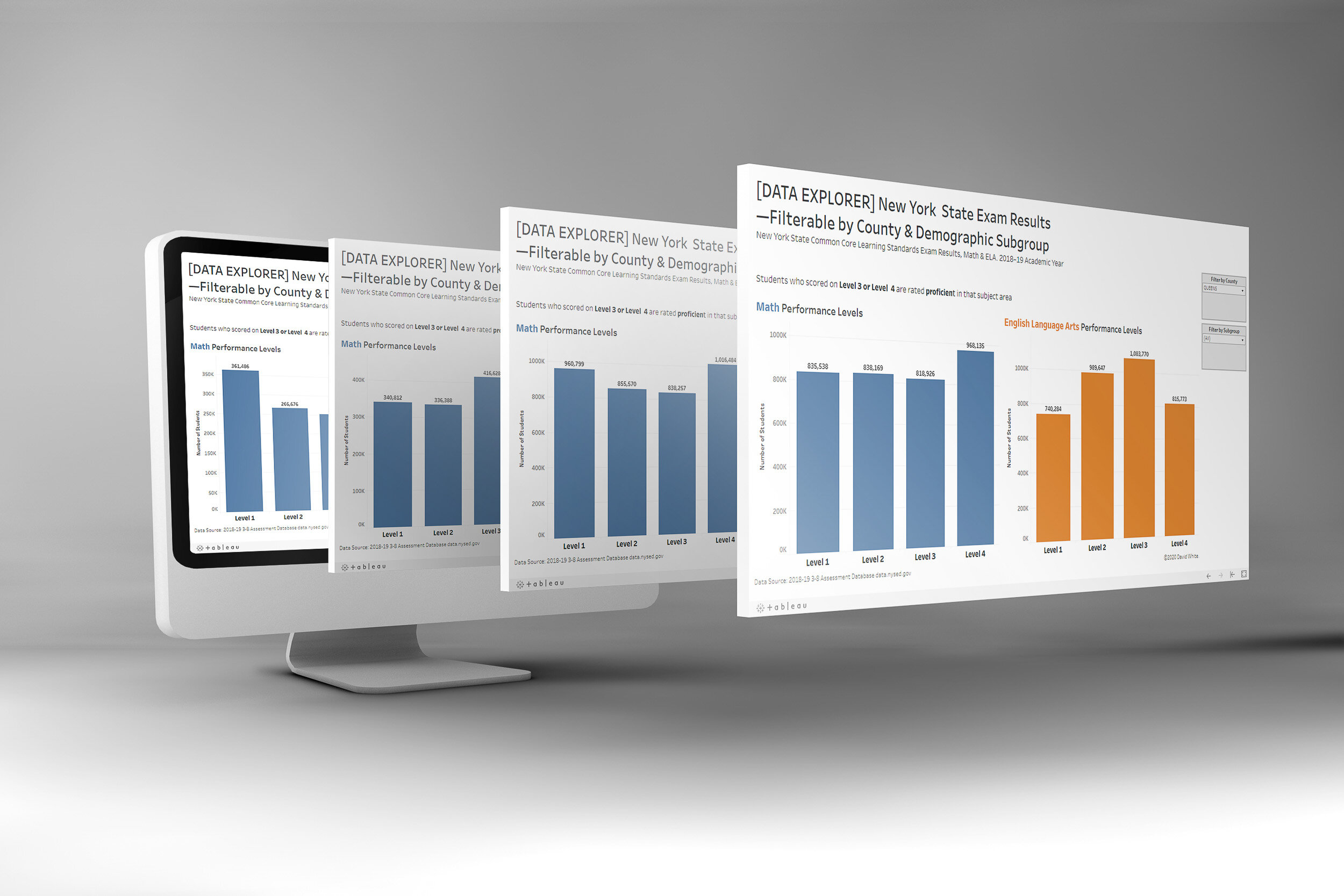
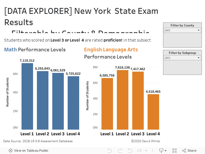
2019 New York State Common Core Learning Standard Exam results…Read more
Insights, Made Fresh Daily
Data Explorer
2019 New York State Common Core Learning Standard Exam results
David White | Sunday, July 4, 2021
This dashboard shows the results of the 2019 New York State Common Core Learning Standard Exam (NYS CCLS). It displays the English Language Arts (ELA) and Math exam scores of New York City public school students in Grades 3–8. The dashboard is filterable by county and demographic subgroup. The underlying data was released by the New York State Education Department (NYSED).
Saturday, July 3, 2021
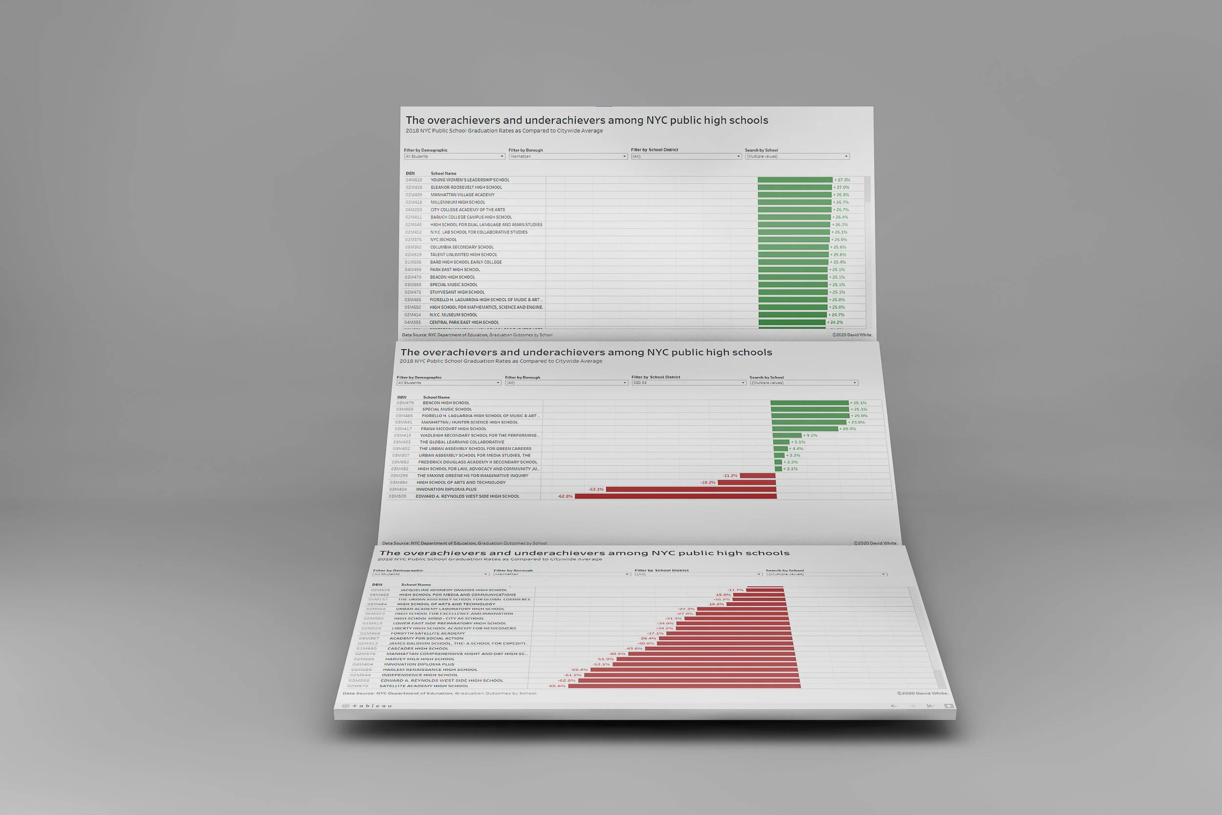
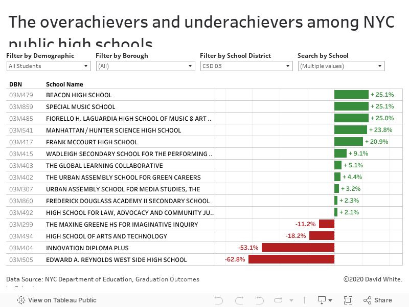
How NYC high schools measure up in comparison to their peers…Read more
Insights, Made Fresh Daily
Standing Out
How NYC high schools measure up in comparison to their peers
David White | Saturday, July 3, 2021
This bar graph shows the graduation rates of NYC high schools in 2018 and how much each school’s graduation rate deviated from the citywide average. The interactive data graphic is filterable by borough, school district and demographic subgroup. The underlying data was released by the City of New York.