
Wednesday, July 14, 2021
Using boxplots to reveal what’s typical and what’s an outlier…Read More

Insights, Made Fresh Daily
Think Inside the Box
Using boxplots to reveal what’s typical and what’s an outlier
David White | Wednesday, July 14, 2021
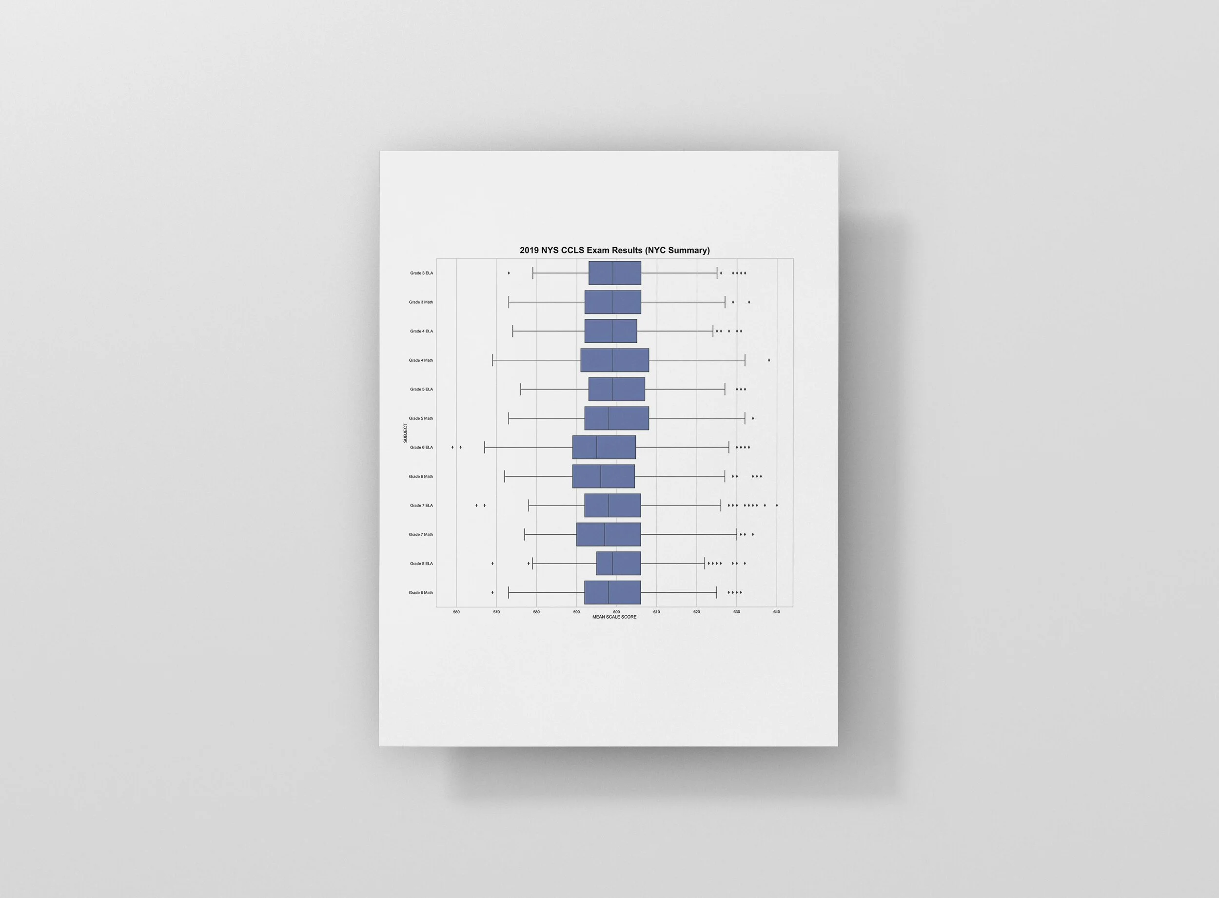
This collection of boxplots shows the distribution of test scores on the 2019 NYS Common Core Learning Standard Exam. The underlying data was released by the New York State Education Department (NYSED).
For each “box and whisker plot” on the page, the vertical line on the left represents the lowest score. The vertical line on the right represents the highest score. The line down the center of the box represents the median score. The distance from the center line to the left end of the box represents the distance from the median to the 25th percentile score. Likewise, the distance from the center line to the right end of the box represents the distance from the median to the 75th percentile score. The dots off to either side represent outliers.