

Monday, July 19, 2021
As literacy rises, so does income…Read More
Insights, Made Fresh Daily
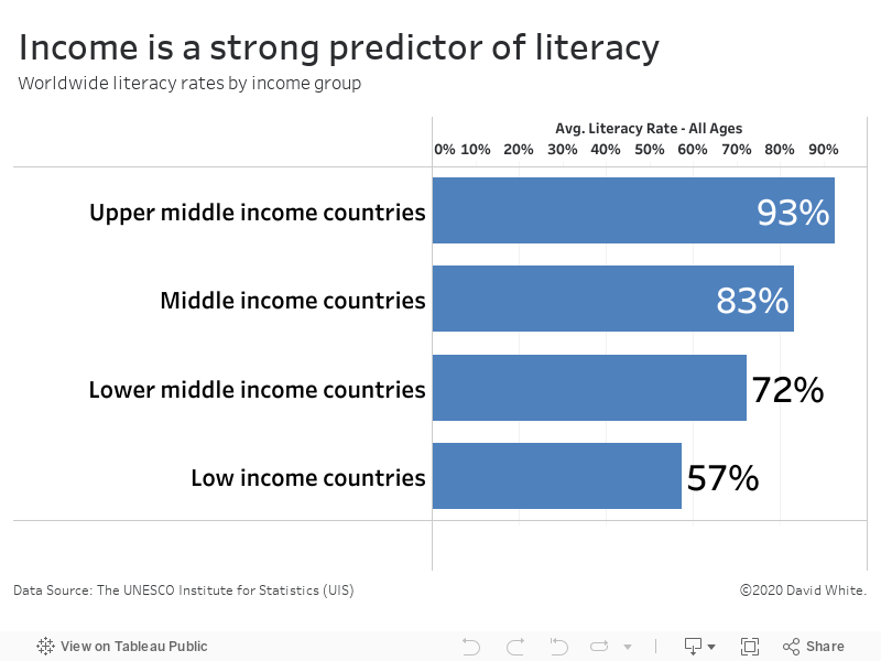
Literacy vs. Income
As literacy rises, so does income
David White | Monday, July 19, 2021
This bar graph illustrates the relationship between income and literacy rates among various countries. The underlying data was released by the United Nations.
It’s clear from the data that income correlates with a country’s literacy rate. Upper-middle income countries have a 93% literacy rate. In contrast, the literacy rate in low-middle income countries is only 57%.
Friday, July 2, 2021
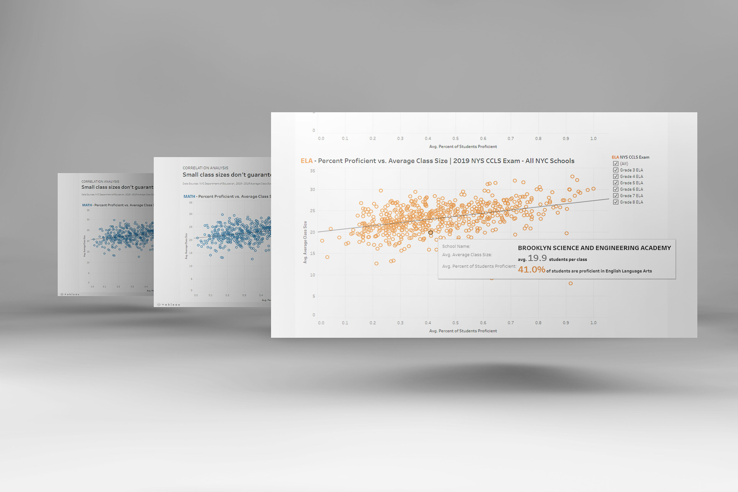
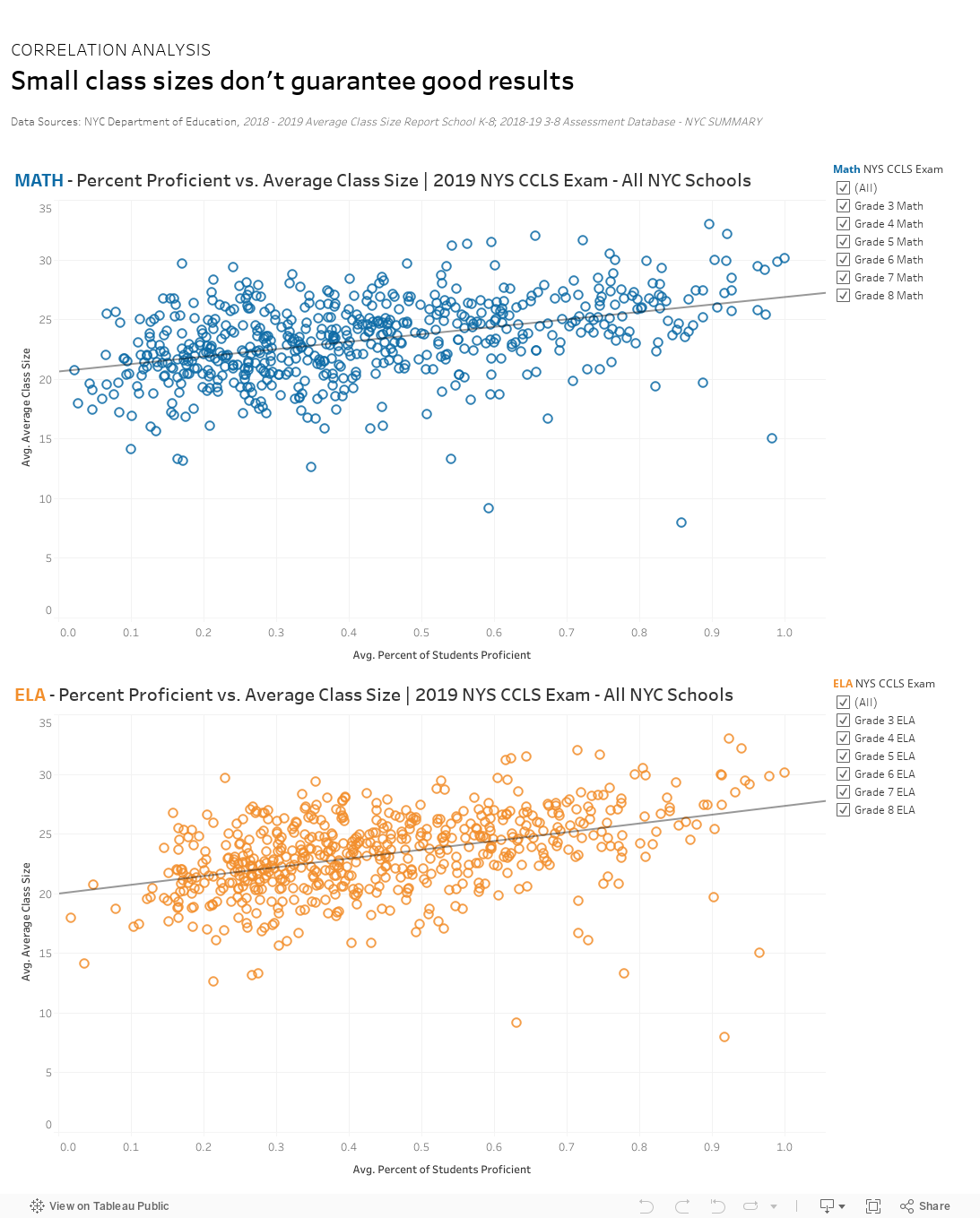
Counterintuitively, student-to-teacher ratios were not a reliable predictor of exam success…Read More
Insights, Made Fresh Daily
Some Unexpected Results
Counterintuitively, student-to-teacher ratios were not a reliable predictor of exam success
David White | Friday, July 2, 2021
This scatterplot shows the relationship between NYC schools’ average class size and their state exam results. The underlying data was released by the New York State Education Department (NYSED).
The data graphic shows the English Language Arts (ELA) and Math exam scores of New York City public school students in Grades 3–8. While there was a small amount of correlation between small class sizes and high exam marks, there were in fact many examples where schools with large class sizes earned high scores. Conversely, there were also several schools with small class sizes who did not perform as well as their peers.