
Saturday, July 3, 2021
How NYC high schools measure up in comparison to their peers…Read more
Insights, Made Fresh Daily
Standing Out
How NYC high schools measure up in comparison to their peers
David White | Saturday, July 3, 2021
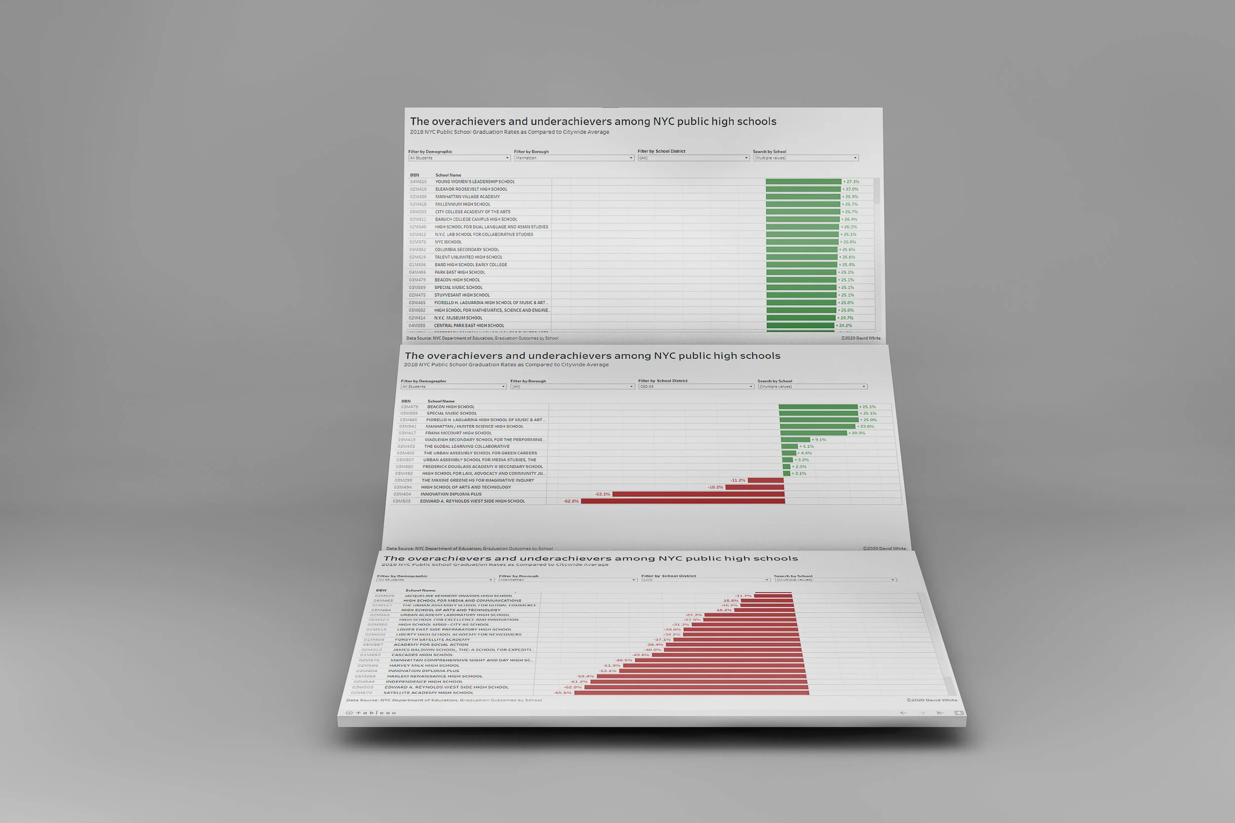
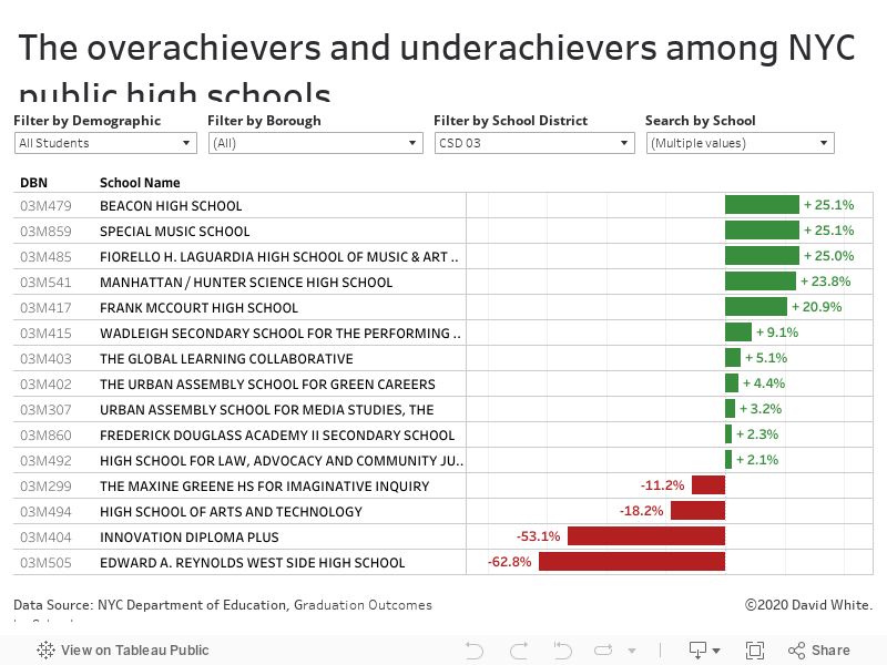
This bar graph shows the graduation rates of NYC high schools in 2018 and how much each school’s graduation rate deviated from the citywide average. The interactive data graphic is filterable by borough, school district and demographic subgroup. The underlying data was released by the City of New York.