

Tuesday, July 27, 2021
There is a wide variance of average class sizes among states across the country.…Read More

Insights, Made Fresh Daily
Teaching and Learning
Student-teacher ratios vary greatly by state
David White | Tuesday, July 27, 2021
This line graph shows the student-teacher ratio of public schools in each state during the 2018–19 academic year. The underlying data was released by the U.S. Department of Education.
The graphic illustrates that there is a wide variance of average class sizes among states across the country.

Monday, July 26, 2021
Hawaii was the state with the highest percentage of non-white public school students with 88%…Read More

Insights, Made Fresh Daily
Diversity in Public Schools
The racial composition of public school student bodies in each state
David White | Monday, July 26, 2021
This bar graph shows the percentages of white and non-white public school students in each state during the 2018–19 academic year. The underlying data was released by the U.S. Department of Education.
Hawaii was the state with the highest percentage of non-white public school students with 88% non-white. Vermont was the state with the lowest percentage of non-white public school students with 10% non-white.

Tuesday, July 20, 2021
Most NYC charter school graduates earned standard Regents diplomas…Read More

Insights, Made Fresh Daily
Advanced Diplomas
Most NYC charter school graduates earned standard Regents diplomas
David White | Tuesday, July 20, 2021
This bar graph shows a breakdown of the types of diplomas earned by NYC charter high school graduates in the 2017–18 academic year. The underlying data was released by the City of New York.
A large majority of NYC charter high school graduates earned standard Regents diplomas. Relatively few graduates earned local diplomas or Advanced Regents diplomas.
Friday, July 16, 2021
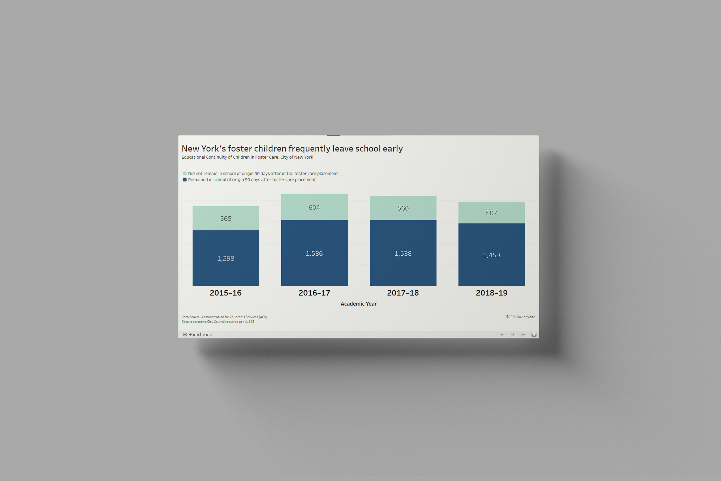
Forster children face significant challenges when it comes to schooling…Read More
Insights, Made Fresh Daily
Home & School
Forster children face significant challenges when it comes to schooling
David White | Friday, July 16, 2021
This bar chart illustrates the one of the many difficulties affecting foster children. Within 90 days of their initial foster care placement, a large number of children had already changed schools at least once. The underlying data was released by the City of New York.

Wednesday, July 7, 2021
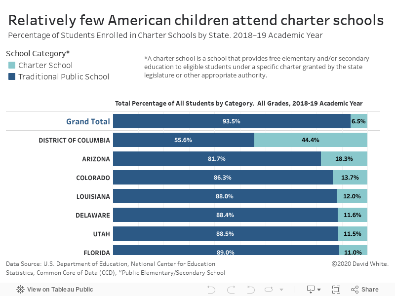
Charter schools dominate the conversation, but not the enrollment numbers…Read more
Insights, Made Fresh Daily
Out of Proportion
Charter schools dominate the conversation, but not the enrollment numbers
David White | Wednesday, July 7, 2021
This 100% bar graph shows the proportion of U.S. students that are enrolled in charter schools vs. how many are enrolled in traditional public schools. The underlying data was released by the U.S. Department of Education.
Despite their prominence in the national conversation and some very high-profile advocates (and detractors), charter schools account for only 6.5% of all public school students in the United States.