

Case Study 011. South Asian Youth Action (SAYA!) Mentor Summaries: Step 5
Step 5 - Publish
Having finished the design and build out process, I moved on to producing the individualized reports. At each team meeting, I printed out a hard copy report for each mentor. The entire report fit on a single sheet of paper (printed front and back). I also emailed them a PDF soft copy. All of the information on each mentor’s report was specific to the mentees in their own caseload. Throughout the school day, the mentors held one-on-one meetings with their mentees. During these meetings, mentors often referred directly to to the printed reports I had produced for them. The mentors told me that the new reports were very helpful to them in communicating with their mentees and keeping them focused on their goals.

SAYA Mentor Summary Reports: Work Process Step 5 of 5
Step 5 - Publish
Having finished the design and build out process, I moved on to producing the individualized reports. At each team meeting, I printed out a hard copy report for each mentor. The entire report fit on a single sheet of paper (printed front and back). I also emailed them a PDF soft copy. All of the information on each mentor’s report was specific to the mentees in their own caseload. Throughout the school day, the mentors held one-on-one meetings with their mentees. During these meetings, mentors often referred directly to to the printed reports I had produced for them. The mentors told me that the new reports were very helpful to them in communicating with their mentees and keeping them focused on their goals.
Case Study 005. South Asian Youth Action (SAYA!) Weather vs. Attendance Tracker: Step 1
Step 1 - Discovery
To begin the process of creating the visualization, I met with the administrators of the intervention program and the mentors who worked directly with the students. I listened to the concerns they had and we talked about the challenges they were facing. I began to form an idea of what information needed to be included in the visualization and what raw data needed to be gathered.

SAYA Attendance vs. Weather: Work Process Step 1 of 5
Step 1 - Discovery
To begin the process of creating the visualization, I met with the administrators of the intervention program and the mentors who worked directly with the students. I listened to the concerns they had and we talked about the challenges they were facing. I began to form an idea of what information needed to be included in the visualization and what raw data needed to be gathered.

Case Study 005. South Asian Youth Action (SAYA!) Weather vs. Attendance Tracker: Step 2
Step 2 - Sketch
Next, I made a rough sketch of what the visualization would look like and what information would go where on the screen.

SAYA Attendance vs. Weather: Work Process Step 2 of 5
Step 2 - Sketch
Next, I made a rough sketch of what the visualization would look like and what information would go where on the screen.

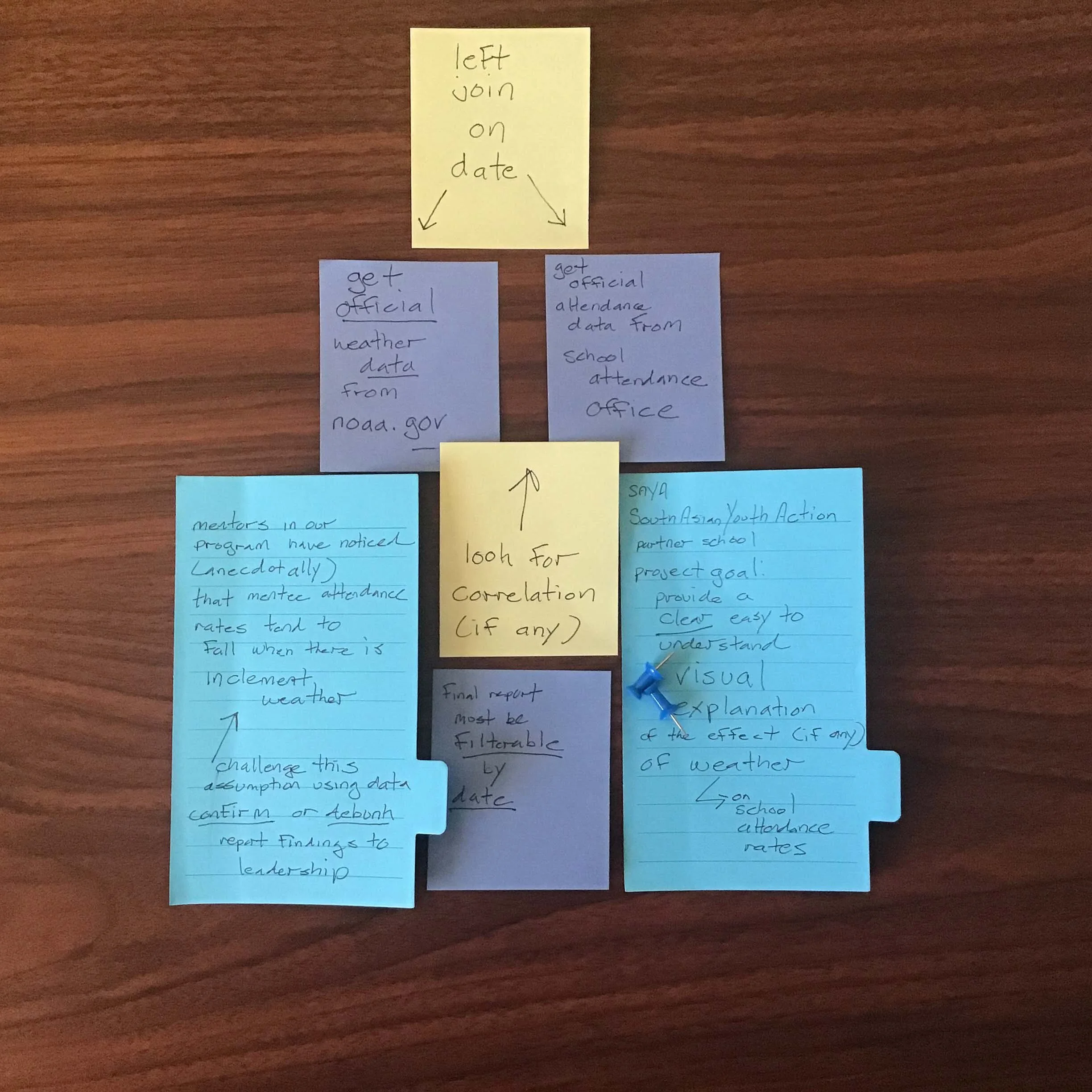
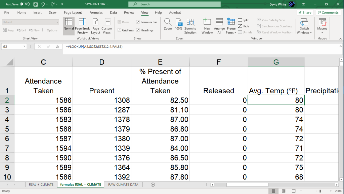
Case Study 005. South Asian Youth Action (SAYA!) Weather vs. Attendance Tracker: Step 3
Step 3 - Prep Data
I collected the school’s attendance data and I joined it with local weather data published by the National Oceanic and Atmospheric Administration (NOAA). Then I lined up the daily attendance data with the NOAA weather data for that school day.
SAYA Attendance vs. Weather: Work Process Step 3 of 5
Step 3 - Prep Data
I collected the school’s attendance data and I joined it with local weather data published by the National Oceanic and Atmospheric Administration (NOAA). Then I lined up the daily attendance data with the NOAA weather data for that school day.

Case Study 005. South Asian Youth Action (SAYA!) Weather vs. Attendance Tracker: Step 4
Step 4 - Build
I built out the visualization using Tableau software. The final result would be projected on a large screen during the team’s weekly meeting and I felt that Tableau was the the best choice for that type of presentation.
SAYA Attendance vs. Weather: Work Process Step 4 of 5
Step 4 - Build
I built out the visualization using Tableau software. The final result would be projected on a large screen during the team’s weekly meeting and I felt that Tableau was the the best choice for that type of presentation.

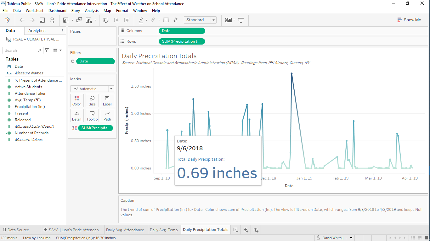
Case Study 005. South Asian Youth Action (SAYA!) Weather vs. Attendance Tracker: Step 5
Step 5 - Publish
I published the finished visualization to Tableau online and I shared it with program administrators via secure link. During the team meeting, the visualization was projected on a large screen locatd at the front of the room. The visualization provided a common point of reference for the mentors and it was used to frame the conversation about their intervention work.

SAYA Attendance vs. Weather: Work Process Step 5 of 5
Step 5 - Publish
I published the finished visualization to Tableau online and I shared it with program administrators via secure link. During the team meeting, the visualization was projected on a large screen locatd at the front of the room. The visualization provided a common point of reference for the mentors and it was used to frame the conversation about their intervention work.

Case Study 004. South Asian Youth Action (SAYA!) Recent Trends in Absenteeism: Step 1
Step 1 - Discovery
To begin the process of creating the visualization, I met with the administrators of the intervention program and the mentors who worked directly with the students. I listened to their anecdotal accounts of what was happening lately with their mentees. I began to form an idea of what raw data needed to be collected and what information needed to be included in the visualization I would produce.
SAYA Attendance Trends: Work Process Step 1 of 5
Step 1 - Discovery
To begin the process of creating the visualization, I met with the administrators of the intervention program and the mentors who worked directly with the students. I listened to their anecdotal accounts of what was happening lately with their mentees. I began to form an idea of what raw data needed to be collected and what information needed to be included in the visualization I would produce.

Case Study 004. South Asian Youth Action (SAYA!) Recent Trends in Absenteeism: Step 2
Step 2 - Sketch
Next, I made a rough sketch of what the visualization would look like and what information would go where on the screen.
SAYA Attendance Trends: Work Process Step 2 of 5
Step 2 - Sketch
Next, I made a rough sketch of what the visualization would look like and what information would go where on the screen.
Case Study 004. South Asian Youth Action (SAYA!) Recent Trends in Absenteeism: Step 3
Step 3 - Prep Data
I collected the raw attendance and school enrollment data I needed and I organized it into a form that would allow it to translate smoothly into visuals.
SAYA Attendance Trends: Work Process Step 3 of 5
Step 3 - Prep Data
I collected the raw attendance and school enrollment data I needed and I organized it into a form that would allow it to translate smoothly into visuals.

Case Study 004. South Asian Youth Action (SAYA!) Recent Trends in Absenteeism: Step 4
Step 4 - Build
I built out the visualization using Tableau software. The final result would be projected on a large screen during the team’s weekly meeting and I felt that Tableau was the the best choice for that type of presentation.
SAYA Attendance Trends: Work Process Step 4 of 5
Step 4 - Build
I built out the visualization using Tableau software. The final result would be projected on a large screen during the team’s weekly meeting and I felt that Tableau was the the best choice for that type of presentation.
Case Study 004. South Asian Youth Action (SAYA!) Recent Trends in Absenteeism: Step 5
Step 5 - Publish
I published the finished visualization to Tableau online and I shared it with program administrators via secure link. At the weekly team meeting, the visualization was projected on a large screen located at the front of the room. It was used to guide the team’s conversations about the what was causing the recent changes in attendance and what stratgegies they could use to intervene.
SAYA Attendance Trends: Work Process Step 5 of 5
Step 5 - Publish
I published the finished visualization to Tableau online and I shared it with program administrators via secure link. At the weekly team meeting, the visualization was projected on a large screen located at the front of the room. It was used to guide the team’s conversations about the what was causing the recent changes in attendance and what stratgegies they could use to intervene.

Case Study 003. South Asian Youth Action (SAYA!) Attendance Tracker: Step 1
Step 1 - Discovery
To begin the process of creating the visualization, I met with the administrators of the intervention program and the mentors who worked directly with the students. I listened to the concerns they had and we talked about the challenges they were facing. I began to form an idea of what information needed to be included in the visualization and what raw data needed to be gathered.
SAYA Attendance Tracker: Work Process Step 1 of 5
Step 1 - Discovery
To begin the process of creating the visualization, I met with the administrators of the intervention program and the mentors who worked directly with the students. I listened to the concerns they had and we talked about the challenges they were facing. I began to form an idea of what information needed to be included in the visualization and what raw data needed to be gathered.

Case Study 003. South Asian Youth Action (SAYA!) Attendance Tracker: Step 2
Step 2 - Sketch
Next, I made a rough sketch of what the visualization would look like and what information would go where on the screen.
SAYA Attendance Tracker: Work Process Step 2 of 5
Step 2 - Sketch
Next, I made a rough sketch of what the visualization would look like and what information would go where on the screen.
Case Study 003. South Asian Youth Action (SAYA!) Attendance Tracker: Step 3
Step 3 - Prep Data
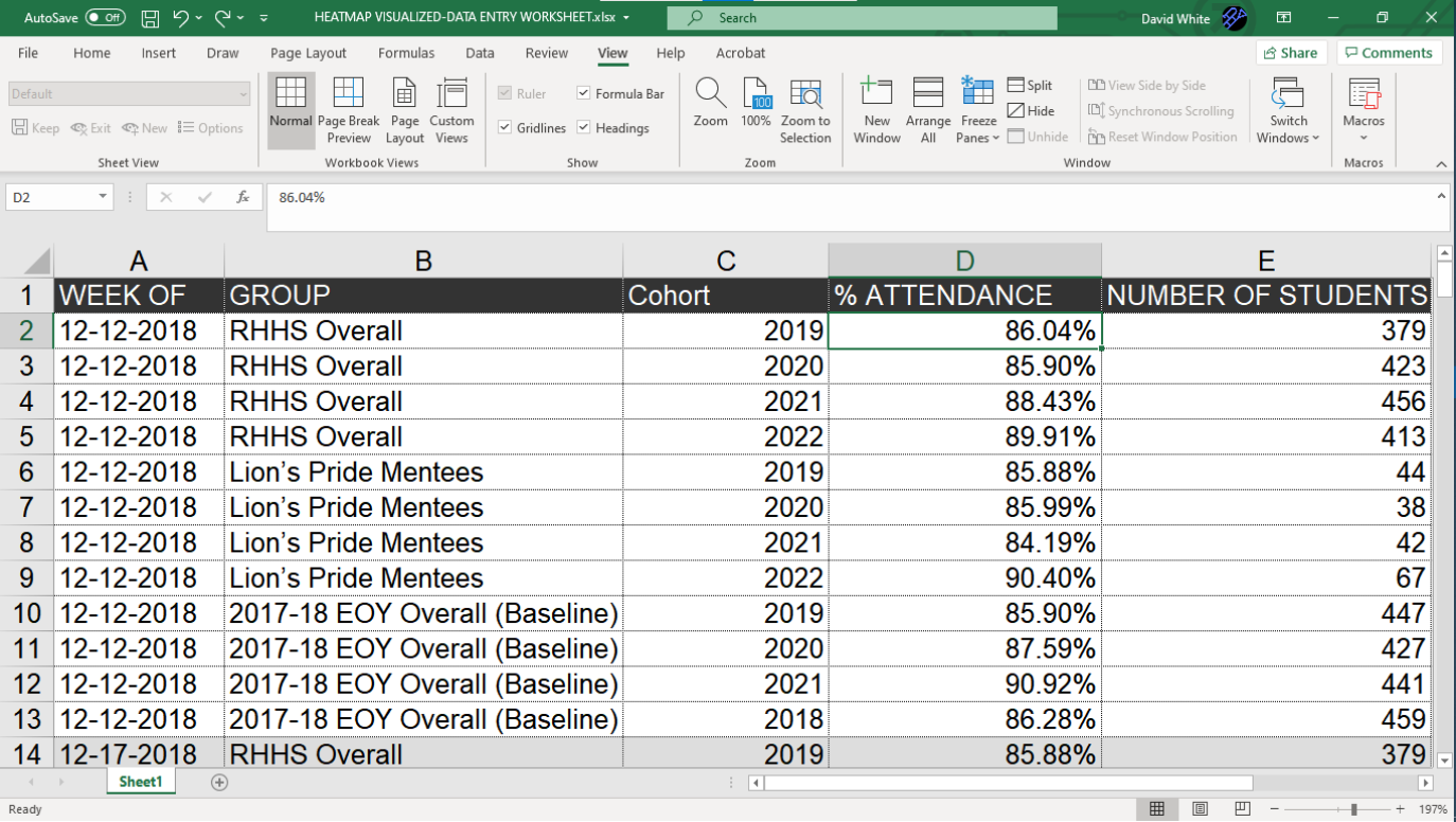
Since this was a visualization that would have to be updated on a weekly basis, I made sure to organize the data files in such a way that they could be updated quickly. I had to ensure that all of the columns for each category of data would line up exactly, every time. Also, since this would be a change-over-time visualization, it was important to make sure that the format for the date was exactly the same for every row of data. (In this case, I used “MM-DD-YYYY” format.)
SAYA Attendance Tracker: Work Process Step 3 of 5
Step 3 - Prep Data
Since this was a visualization that would have to be updated on a weekly basis, I made sure to organize the data files in such a way that they could be updated quickly. I had to ensure that all of the columns for each category of data would line up exactly, every time. Also, since this would be a change-over-time visualization, it was important to make sure that the format for the date was exactly the same for every row of data. (In this case, I used “MM-DD-YYYY” format.)

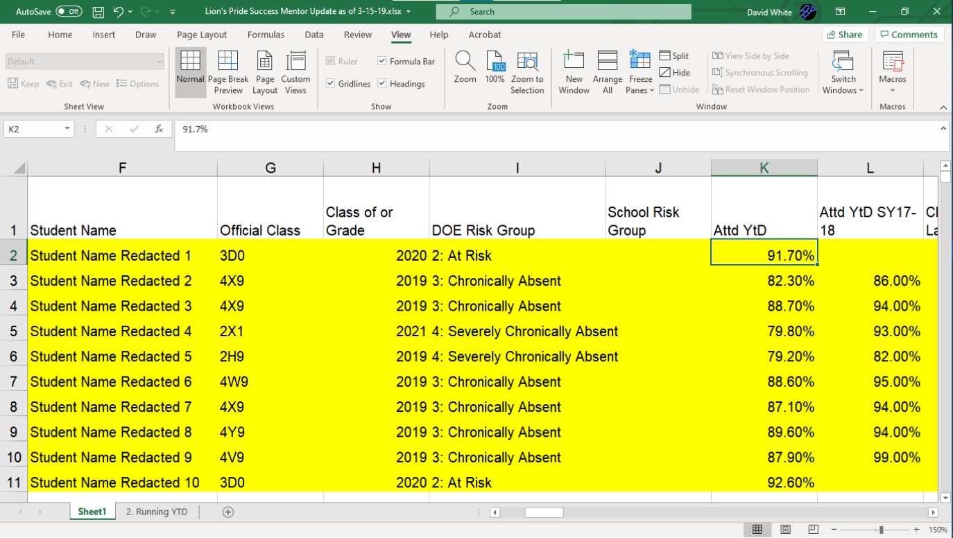
Case Study 003. South Asian Youth Action (SAYA!) Attendance Tracker: Step 4
Step 4 - Build
I built out the visualization using Tableau software. The final result would be projected on a large screen during the weekly meetings and I felt that Tableau was the the best choice for that type of presentation.
SAYA Attendance Tracker: Work Process Step 4 of 5
Step 4 - Build
I built out the visualization using Tableau software. The final result would be projected on a large screen during the weekly meetings and I felt that Tableau was the the best choice for that type of presentation.
Case Study 003. South Asian Youth Action (SAYA!) Attendance Tracker: Step 5
Step 5 - Publish
I published the finished visualization to Tableau online and I shared it with program administrators via secure link. At the weekly meetings, the visualization was projected on a large screen located at the front of the room. The visualization provided a common point of reference for the team and it was used to frame the conversations they were having about their shared work.
SAYA Attendance Tracker: Work Process Step 5 of 5
Step 5 - Publish
I published the finished visualization to Tableau online and I shared it with program administrators via secure link. At the weekly meetings, the visualization was projected on a large screen located at the front of the room. The visualization provided a common point of reference for the team and it was used to frame the conversations they were having about their shared work.

Case Study 002. GCCS Mock Exam Data Analysis Kit: Step 1
Step 1 - Discovery
My first step was to meet with teachers and instructional coaches to determine specifically what their challenges were and what kind of tools they needed. We looked at the testing schedule and the topics to be covered by each test. We identified that the targets were for each classroom on each test.

GCCS Data Analysis Kit: Work Process Step 1 of 5
Step 1 - Discovery
My first step was to meet with teachers and instructional coaches to determine specifically what their challenges were and what kind of tools they needed. We looked at the testing schedule and the topics to be covered by each test. We identified that the targets were for each classroom on each test.

Case Study 002. GCCS Mock Exam Data Analysis Kit: Step 2
Step 2 - Sketch
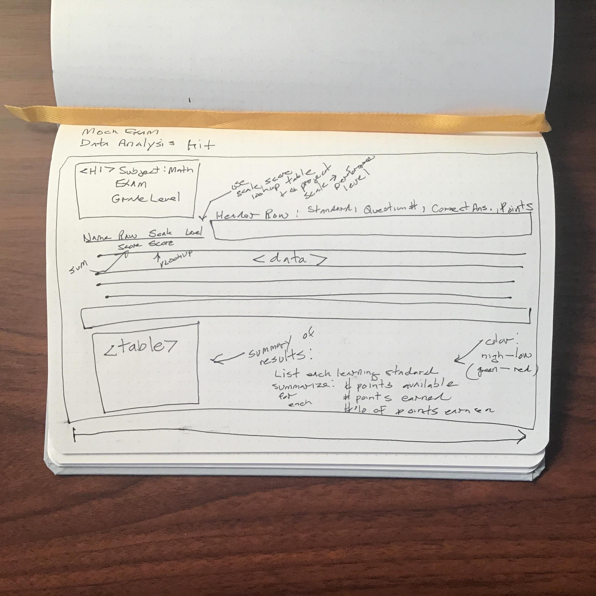
Spreadsheets can often be overwhelming to look at and difficult to use. I wanted to avoid those problems by making the new tool both aesthetically-pleasing and user-friendly. I sketched out what I wanted the tool to look like and how it would function.
GCCS Data Analysis Kit: Work Process Step 2 of 5
Step 2 - Sketch
Spreadsheets can often be overwhelming to look at and difficult to use. I wanted to avoid those problems by making the new tool both aesthetically-pleasing and user-friendly. I sketched out what I wanted the tool to look like and how it would function.

Case Study 002. GCCS Mock Exam Data Analysis Kit: Step 3
Step 3 - Prep Data
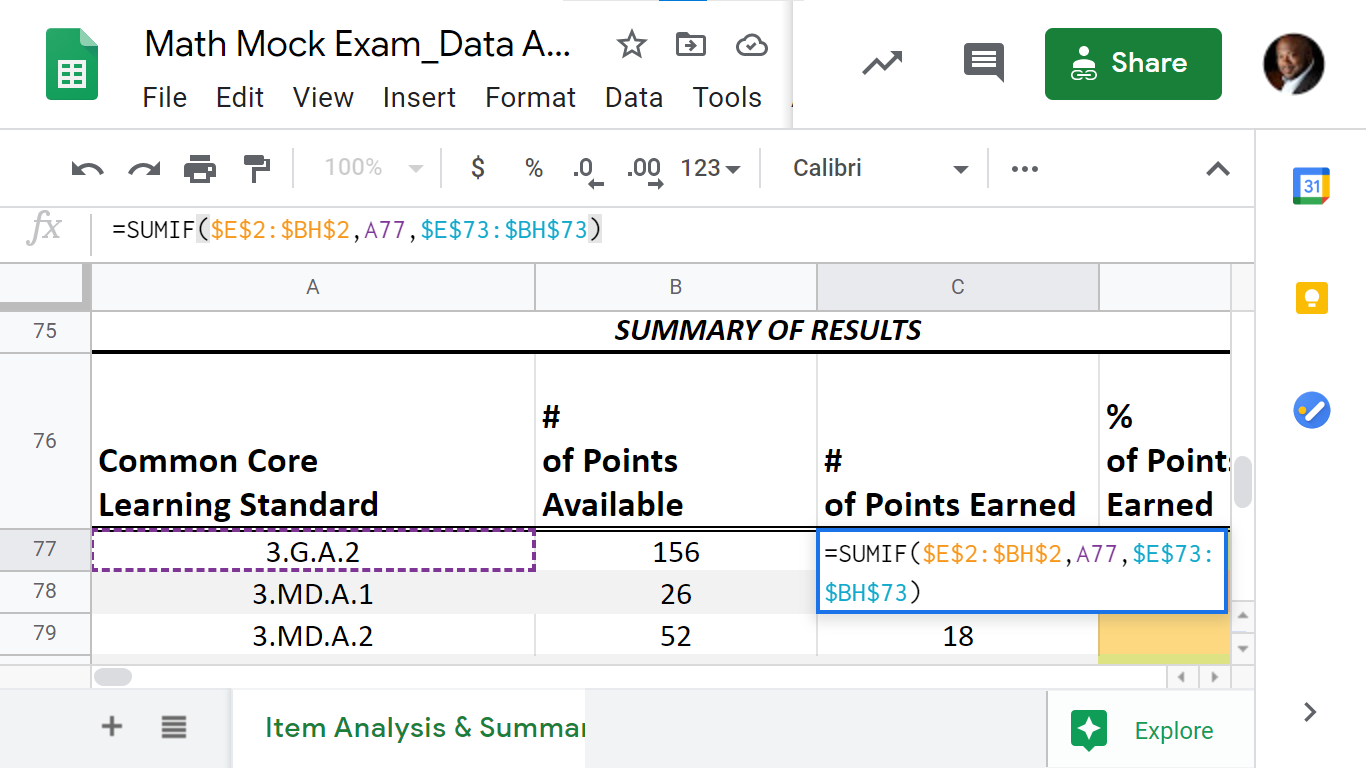
The data tool predicted the students’ performance on future exams. In order to accomplish this, I researched past state exams and mapped them to the material on the practice exams.
GCCS Data Analysis Kit: Work Process Step 3 of 5
Step 3 - Prep Data
The data tool predicted the students’ performance on future exams. In order to accomplish this, I researched past state exams and mapped them to the material on the practice exams.

Case Study 002. GCCS Mock Exam Data Analysis Kit: Step 4
Step 4 - Build
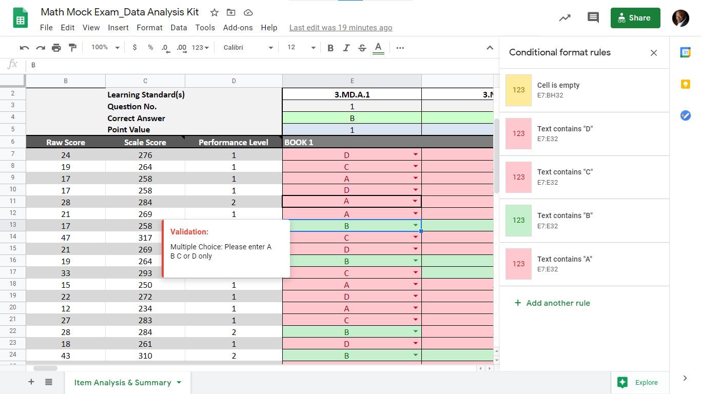
To build the tool, I used Microsoft Excel. I chose Excel because it was available to everyone in the organization and it was a tool that staff members were already familiar with and felt comfortable using.
GCCS Data Analysis Kit: Work Process Step 4 of 5
Step 4 - Build
To build the tool, I used Microsoft Excel. I chose Excel because it was available to everyone in the organization and it was a tool that staff members were already familiar with and felt comfortable using.