

Wednesday, July 28, 2021
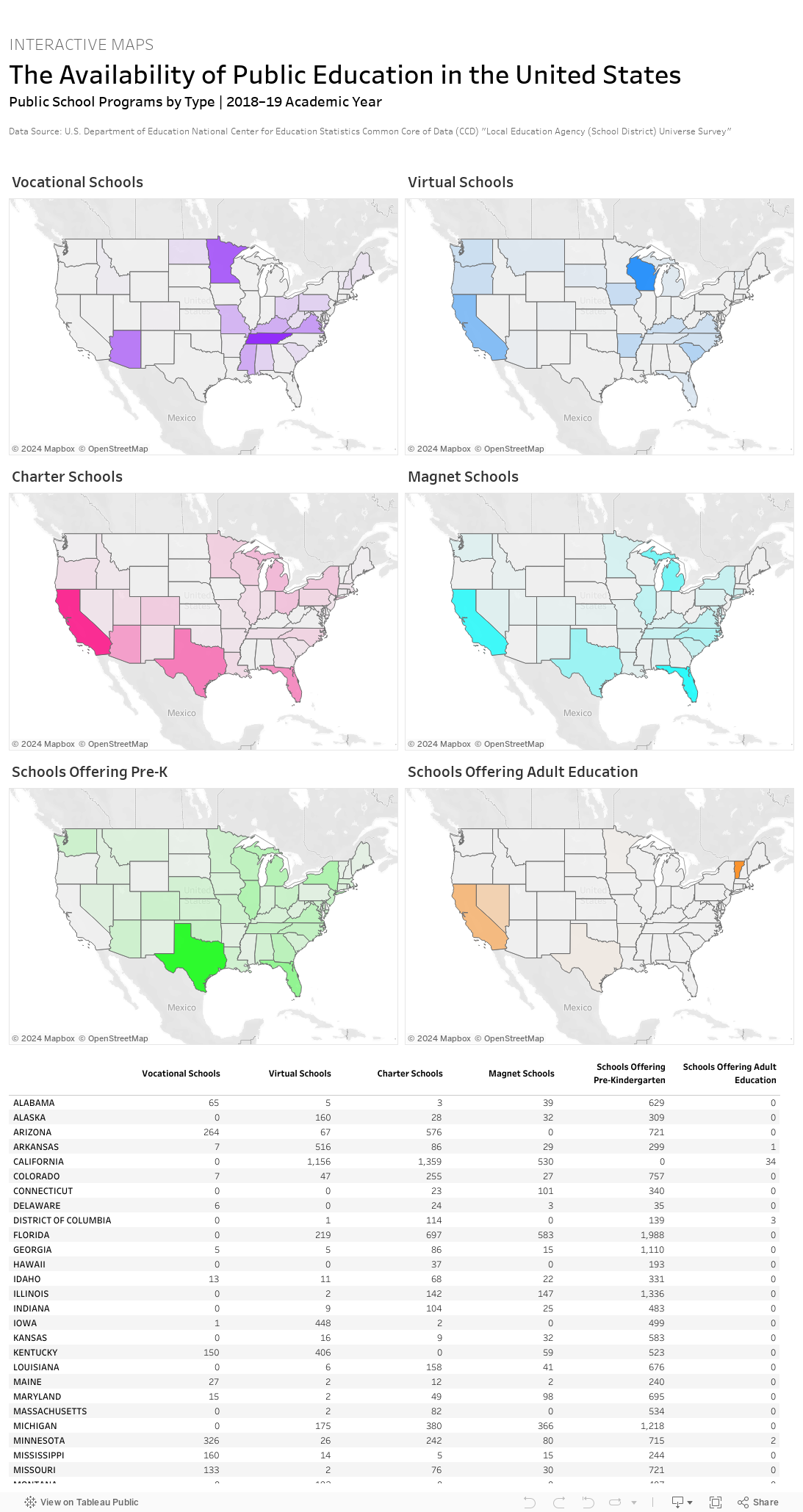
This collection of interactive maps shows where, geographically, alternative educational programs (such as vocational school, charter schools, magnet schools, etc.) are available in the United States.…Read More
Insights, Made Fresh Daily
Open Enrollment
The availability of alternative educational programs across various states
David White | Wednesday, July 28, 2021
This collection of interactive maps shows where, geographically, alternative educational programs (such as vocational school, charter schools, magnet schools, etc.) are available in the United States. The underlying data was released by the U.S. Department of Education.

Tuesday, July 13, 2021
Public education budgets as a percentage of GDP…Read More

Insights, Made Fresh Daily
Tuition Assistance
Public education budgets as a percentage of GDP
David White | Tuesday, July 13, 2021
This interactive map shows how much each country spends on public education as a percentage of its Gross Domestic Product (GDP). The underlying data was released by the United Nations.
Friday, July 9, 2021
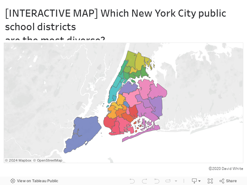
The demographic makeup of each NYC school district…Read more
Insights, Made Fresh Daily
Diverse Backgrounds
The demographic makeup of each NYC school district
David White | Friday, July 9, 2021
This interactive map shows the racial composition of each of New York City’s community school districts. Hover your mouse (or tap if you’re using a mobile device) to learn more about each district. The underlying data was released by the City of New York.