

Monday, July 19, 2021
As literacy rises, so does income…Read More
Insights, Made Fresh Daily
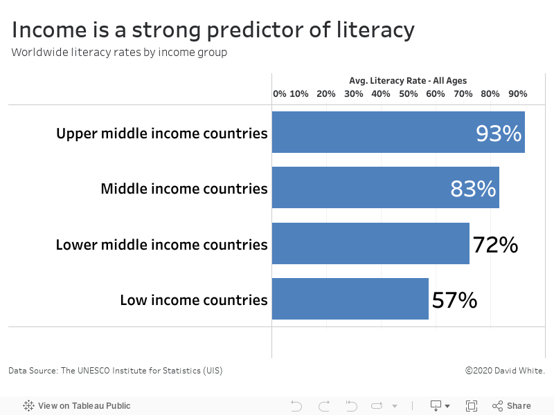
Literacy vs. Income
As literacy rises, so does income
David White | Monday, July 19, 2021
This bar graph illustrates the relationship between income and literacy rates among various countries. The underlying data was released by the United Nations.
It’s clear from the data that income correlates with a country’s literacy rate. Upper-middle income countries have a 93% literacy rate. In contrast, the literacy rate in low-middle income countries is only 57%.

Sunday, July 18, 2021
The racial composition of NYC public high schools…Read More
Insights, Made Fresh Daily
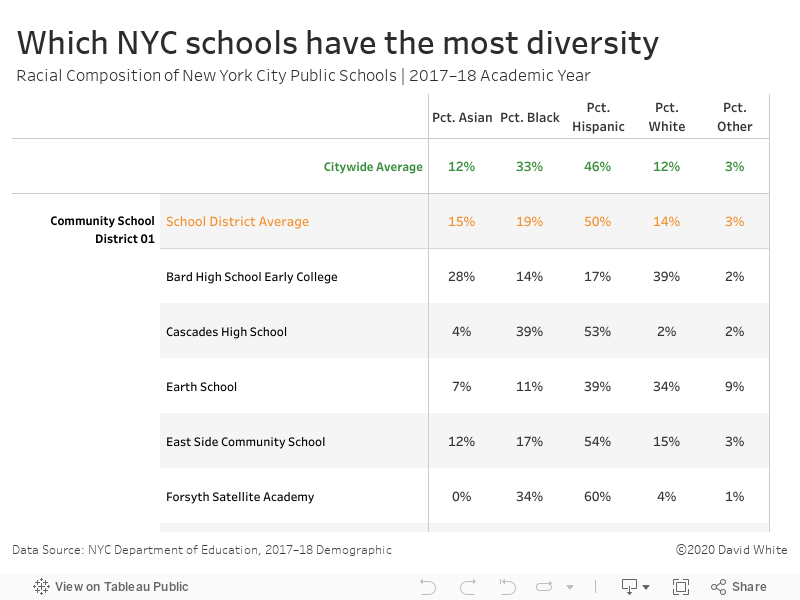
Percent Composition
The racial composition of NYC public high schools
David White | Sunday, July 18, 2021
This graphic organizer lists the racial composition of individual NYC public schools. The citywide averages and the school district averages are shown at the top in orange and green respectively. The underlying data was released by the City of New York.
Saturday, July 17, 2021
Education outcomes in NYC public high schools…Read More
Insights, Made Fresh Daily
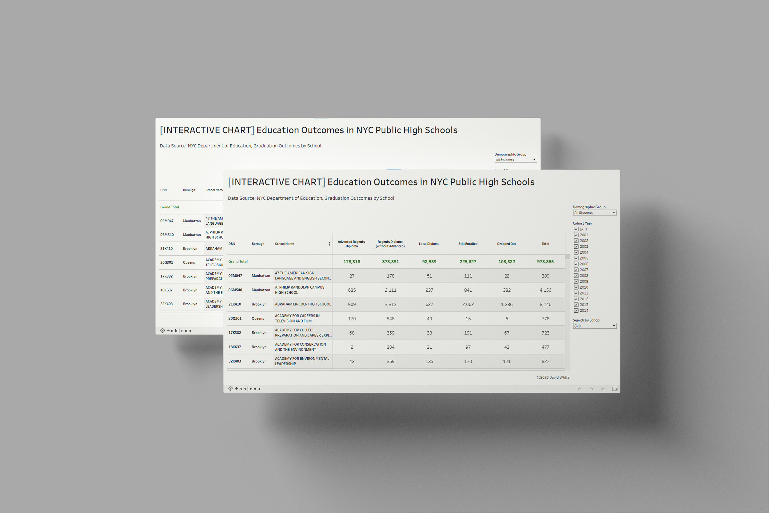
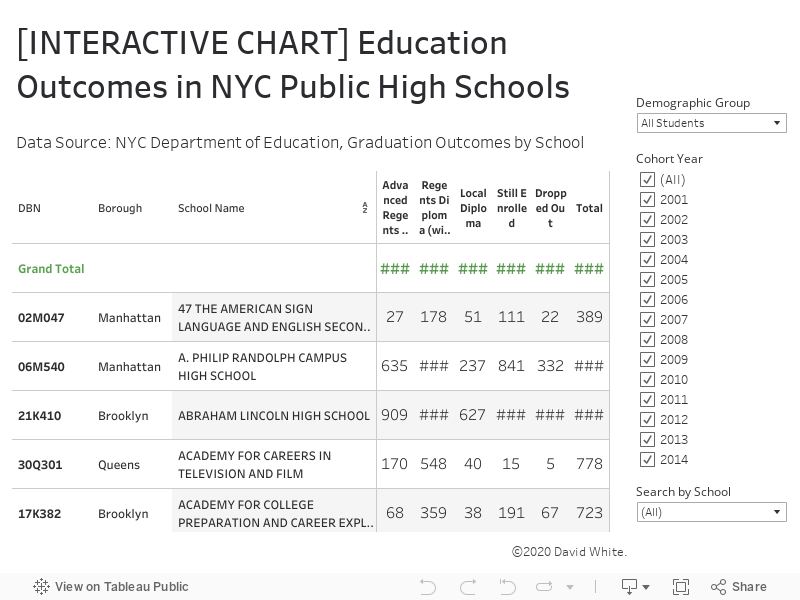
Results May Vary
Education outcomes in NYC public high schools
David White | Saturday, July 17, 2021
This dashboard shows the education outcomes (diploma, dropped out or still enrolled) of each NYC public high school. The chart is filterable by cohort year and demographic subgroup. The underlying data was released by the City of New York.
Friday, July 16, 2021
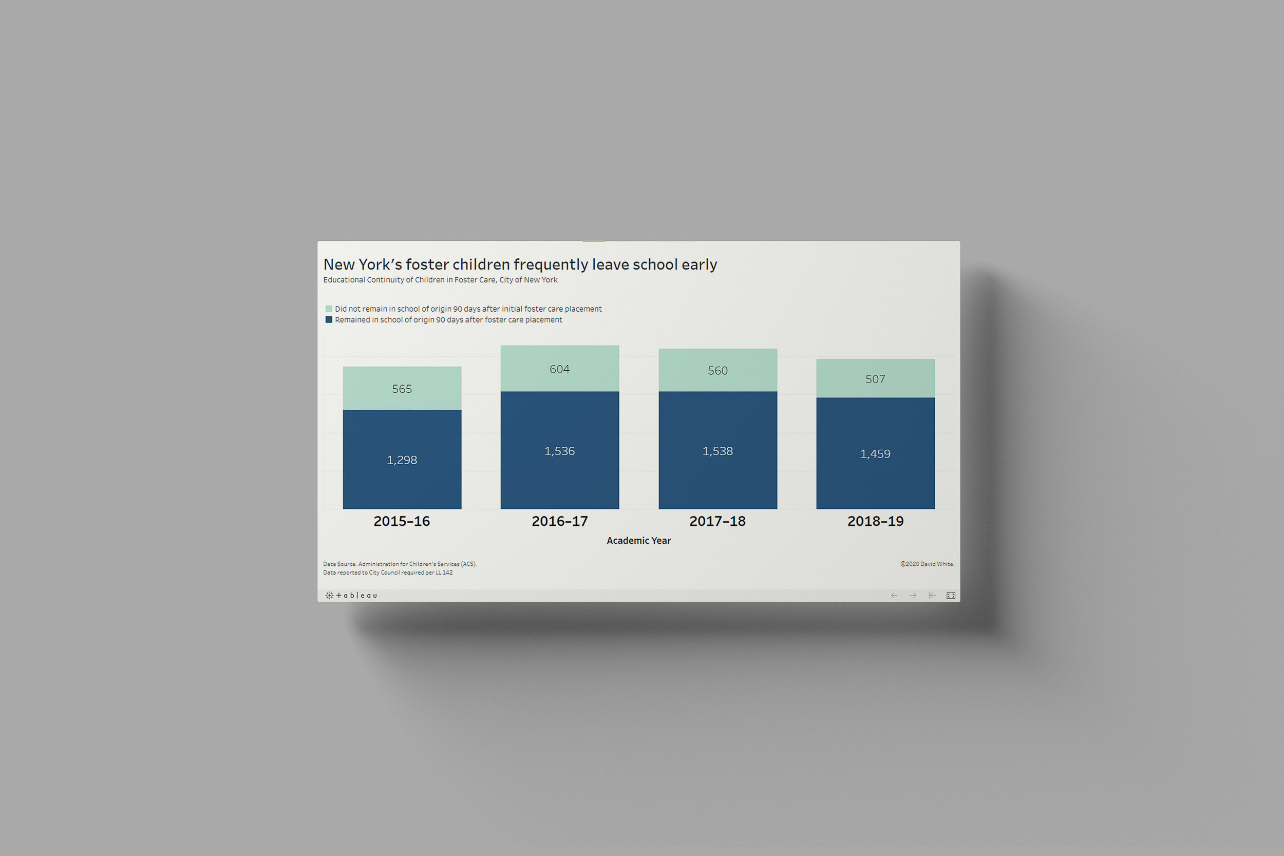
Forster children face significant challenges when it comes to schooling…Read More
Insights, Made Fresh Daily
Home & School
Forster children face significant challenges when it comes to schooling
David White | Friday, July 16, 2021
This bar chart illustrates the one of the many difficulties affecting foster children. Within 90 days of their initial foster care placement, a large number of children had already changed schools at least once. The underlying data was released by the City of New York.

Thursday, July 15, 2021
In 2019, the State of New York awarded financial aid to more than 250,000 college students…Read More

Insights, Made Fresh Daily
David White | Thursday, July 15, 2021
Data Source: State of New York
This infographic is based on the dataset Tuition Assistance Program (TAP) Fall Headcount By College, Sector Group, and Level of Study: Beginning 2000:
I calculated the summary statistics using Python and Google Colab.
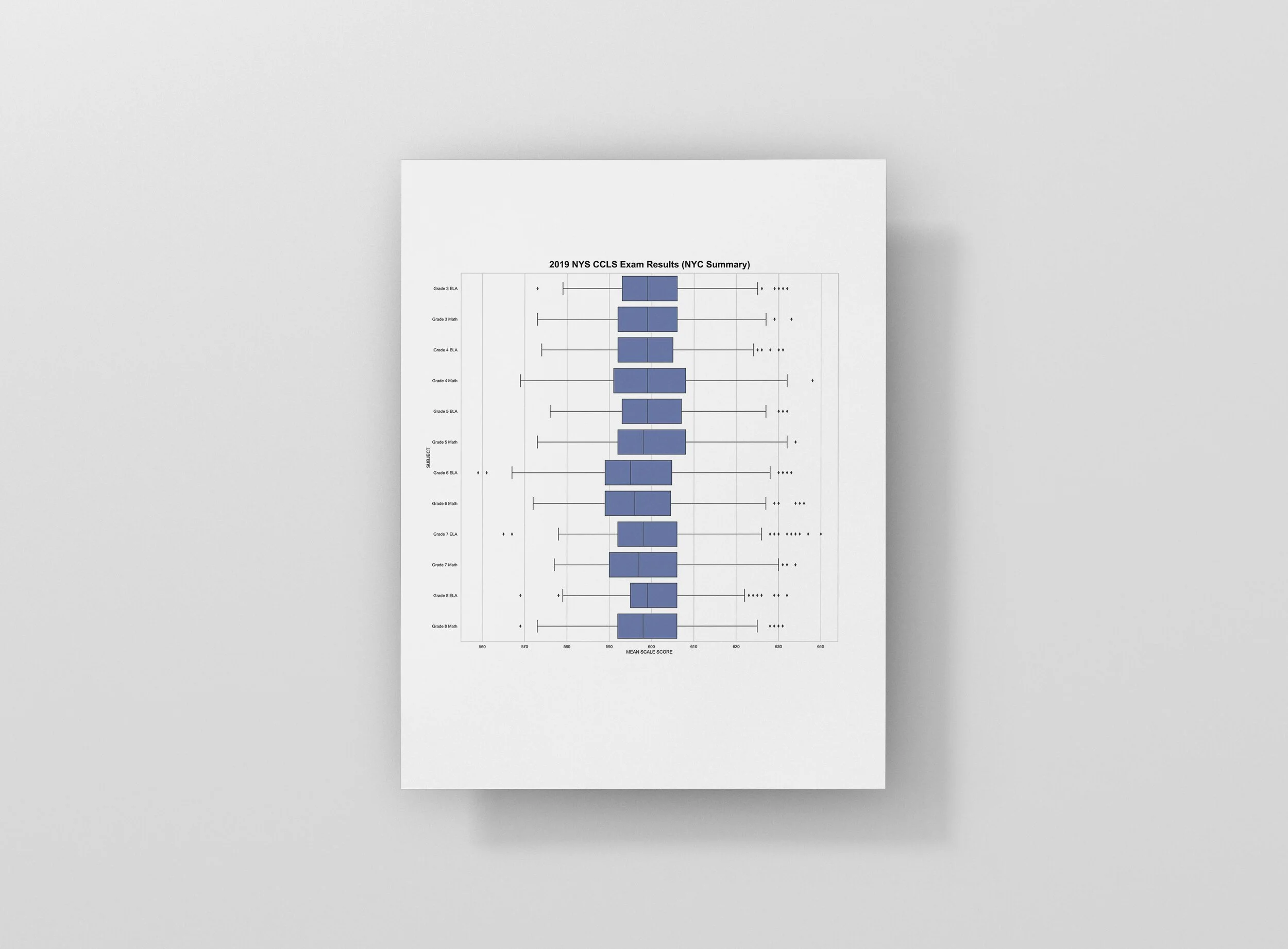
Wednesday, July 14, 2021
Using boxplots to reveal what’s typical and what’s an outlier…Read More

Insights, Made Fresh Daily
Think Inside the Box
Using boxplots to reveal what’s typical and what’s an outlier
David White | Wednesday, July 14, 2021
This collection of boxplots shows the distribution of test scores on the 2019 NYS Common Core Learning Standard Exam. The underlying data was released by the New York State Education Department (NYSED).
For each “box and whisker plot” on the page, the vertical line on the left represents the lowest score. The vertical line on the right represents the highest score. The line down the center of the box represents the median score. The distance from the center line to the left end of the box represents the distance from the median to the 25th percentile score. Likewise, the distance from the center line to the right end of the box represents the distance from the median to the 75th percentile score. The dots off to either side represent outliers.

Tuesday, July 13, 2021
Public education budgets as a percentage of GDP…Read More

Insights, Made Fresh Daily
Tuition Assistance
Public education budgets as a percentage of GDP
David White | Tuesday, July 13, 2021
This interactive map shows how much each country spends on public education as a percentage of its Gross Domestic Product (GDP). The underlying data was released by the United Nations.

Monday, July 12, 2021
NYC's students are better prepared for college than they were four years ago…Read More
![[SUBSET - College Readiness, 2013 vs. 2017] MSM-DS09-Social_Indicator_Report_Data](https://images.squarespace-cdn.com/content/v1/5a1ce5de18b27dba1cfec1fa/1612032677761-P2AK7MRSC0PF1LP4OKQS/%5BSUBSET+-+College+Readiness%2C+2013+vs.+2017%5D+MSM-DS09-Social_Indicator_Report_Data)
Insights, Made Fresh Daily
Being Prepared
NYC's students are better prepared for college than they were four years ago
David White | Monday, July 12, 2021
This collection of slope graphs illustrates the recent trends in college readiness among NYC high school graduates in various demographic subgroups. The underlying data was released by the City of New York.
The data graphics show an upward trend in the percentage of students who are “college ready” according to The College Readiness Index:
The College Readiness Index (CRI) is calculated by the NYC Department of Education and includes students who meet CUNY’s remediation standards, which are currently defined as: (1) graduated by August with a Regents diploma, (2) earned a 75+ on the English Regents exam, or scored 480+ on the Critical Reading SAT, or scored a 20+ on the ACT English, or scored a 70+ on the CUNY Reading Assessment and a 56+ on the CUNY Writing Assessment, and (3) scored an 80+ on a Math Regents, or 70+ on a Common Core Algebra or Geometry Regents and completed coursework in Algebra II/Trigonometry or higher, or scored 480+ on the Math SAT, or scored a 20+ on the ACT Math, or scored a 40+ on the CUNY Math Assessment, or scored an 80+ on the PBAT and completed required coursework.
Source: NYC Department of Education

Sunday, July 11, 2021
This exploratory data analysis examines a dataset of information on public schools in the City of New York…Read More

Student-Teacher Ratios - Exploratory Data Analysis (EDA) by David White
Insights, Made Fresh Daily
Exploratory Data Analysis
Student-Teacher Ratios in NYC Public Schools
David White | Sunday, July 11, 2021
What is Exploratory Data Analysis?
Exploratory data analysis (EDA) is a technique used by data scientists to inspect, characterize and briefly summarize the contents of a dataset. EDA is often the first step when encountering a new or unfamiliar dataset. EDA helps the data scientist become acquainted with a dataset and test some basic assumptions about the data. By the end of the EDA process, some initial insights can be drawn from the dataset and a framework for further analysis or modeling is established.
This exploratory data analysis examines a dataset of information on public schools in the City of New York. The underlying data was released by the City of New York.

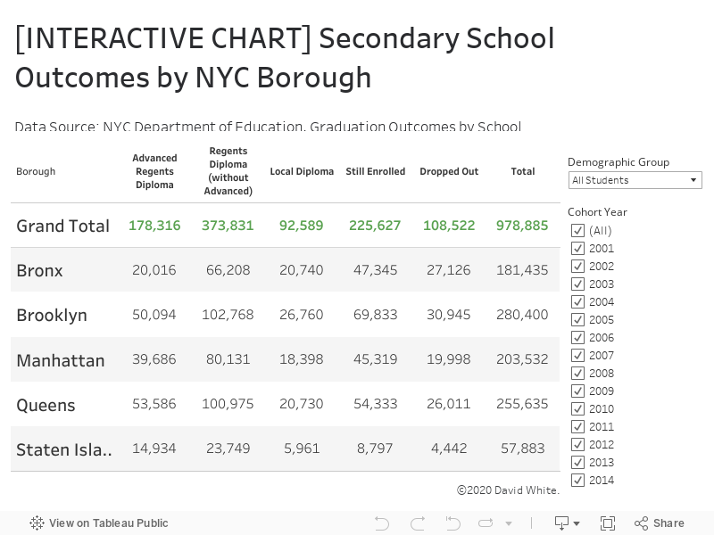
Saturday, July 10, 2021
The secondary school outcomes of NYC students…Read more
Insights, Made Fresh Daily
Futures in Focus
The secondary school outcomes of NYC students
David White | Saturday, July 10, 2021
This graphic organizer shows the recent graduation outcomes of students enrolled in NYC high schools. The chart is filterable and allows you to sort the data by cohort year (the year a student entered 9th grade) and demographic subgroup. The underlying data was released by the City of New York.
Friday, July 9, 2021
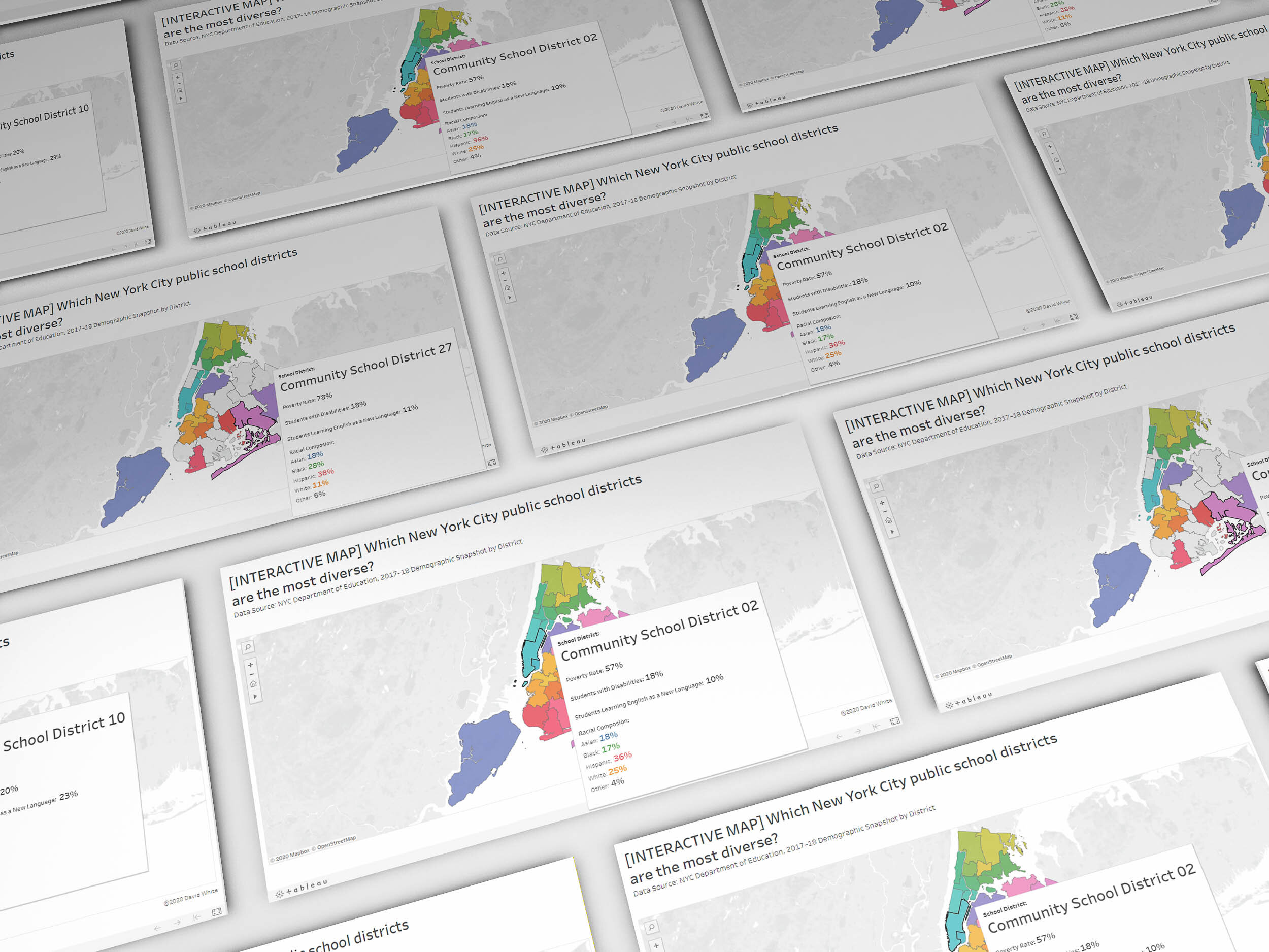
The demographic makeup of each NYC school district…Read more
Insights, Made Fresh Daily
Diverse Backgrounds
The demographic makeup of each NYC school district
David White | Friday, July 9, 2021
This interactive map shows the racial composition of each of New York City’s community school districts. Hover your mouse (or tap if you’re using a mobile device) to learn more about each district. The underlying data was released by the City of New York.

Thursday, July 8, 2021
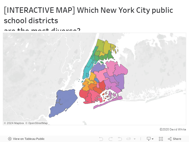
The NYC Department of Education accounted for more spending than any other city department…Read more
Insights, Made Fresh Daily
Tuition & Fees
The NYC Department of Education accounted for more spending than any other city department
David White | Thursday, July 8, 2021
This bar graph depicts the City of New York’s spending totals by department. The underlying data was released by the City of New York.
In Fiscal year 2018, the City of New York spent more than $2.5 billion on public education which was the most of any city department or agency. The next highest spending total was the Human Resources Administration with a total yearly budget of $990 million.

Wednesday, July 7, 2021
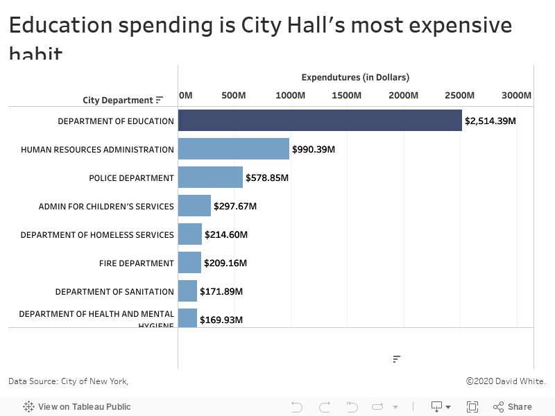
Charter schools dominate the conversation, but not the enrollment numbers…Read more
Insights, Made Fresh Daily
Out of Proportion
Charter schools dominate the conversation, but not the enrollment numbers
David White | Wednesday, July 7, 2021
This 100% bar graph shows the proportion of U.S. students that are enrolled in charter schools vs. how many are enrolled in traditional public schools. The underlying data was released by the U.S. Department of Education.
Despite their prominence in the national conversation and some very high-profile advocates (and detractors), charter schools account for only 6.5% of all public school students in the United States.

Tuesday, July 6, 2021
The City of New York has its sights set on some lofty goals…Read more
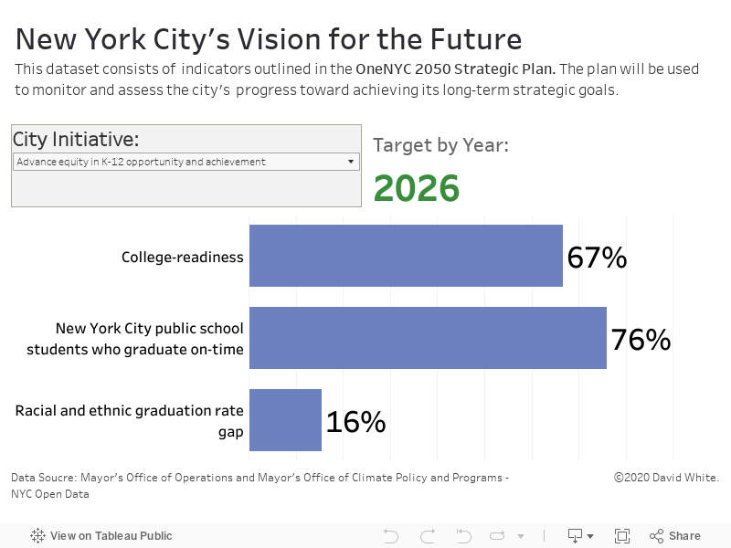
Insights, Made Fresh Daily
Higher Aspirations
The City of New York has its sights set on some lofty goals
David White | Tuesday, July 6, 2021
This dashboard shows goals that the government of the City of New York has set for various areas of public life. The underlying data was released by the City of New York.
The interactive data visualization outlines each of goals laid out in the OneNYC 2050 Strategic Plan along with the target numbers the city is trying to achieve and the dates by which they aim to achieve them.

Monday, July 5, 2021
Students entering 9th grade in 2014 took varied paths…Read more
Sankey Diagrams by David White — click images to enlarge


Insights, Made Fresh Daily
What Ever Happened to...Cohort 2014
NYC students entering 9th grade in 2014 took varied paths
David White | Monday, July 5, 2021
This collection of Sankey diagrams illustrates the education outcomes of students who entered 9th grade in 2014, in each of New York City’s boroughs. The underlying data was released by the City of New York.
Some key takeaways from the data:
about 75% of students entering 9th grade in 2014 graduated high school on-time
less than a third of graduates earned advanced diplomas
about 7% of students entering 9th grade in 2014 dropped out of high school
about 15% of students entering 9th grade in 2014 did not graduate on-time (in 4 years) and are still pursuing their diplomas
Sunday, July 4, 2021
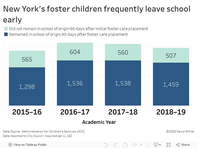
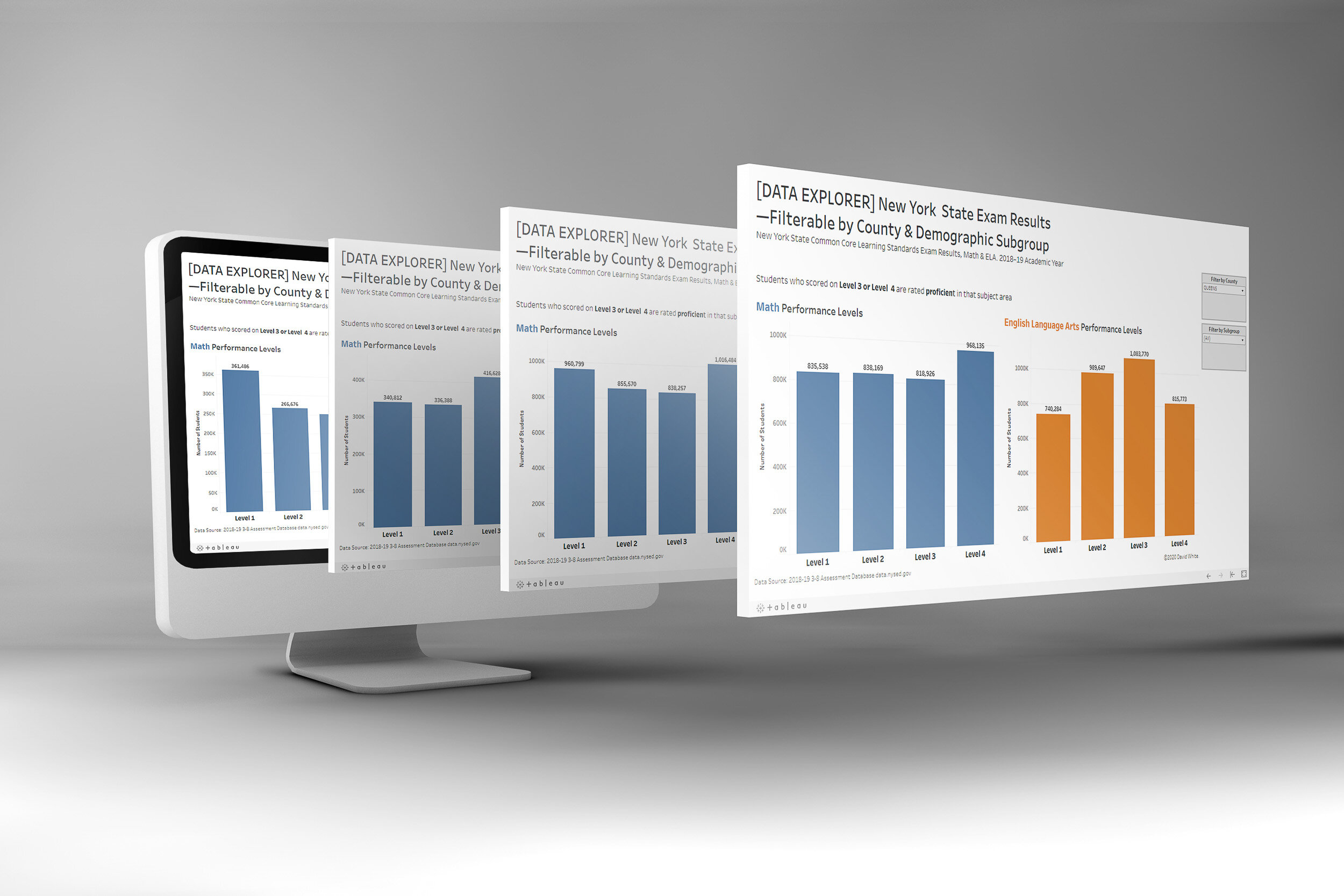
2019 New York State Common Core Learning Standard Exam results…Read more
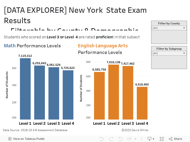
Insights, Made Fresh Daily
Data Explorer
2019 New York State Common Core Learning Standard Exam results
David White | Sunday, July 4, 2021
This dashboard shows the results of the 2019 New York State Common Core Learning Standard Exam (NYS CCLS). It displays the English Language Arts (ELA) and Math exam scores of New York City public school students in Grades 3–8. The dashboard is filterable by county and demographic subgroup. The underlying data was released by the New York State Education Department (NYSED).
Saturday, July 3, 2021
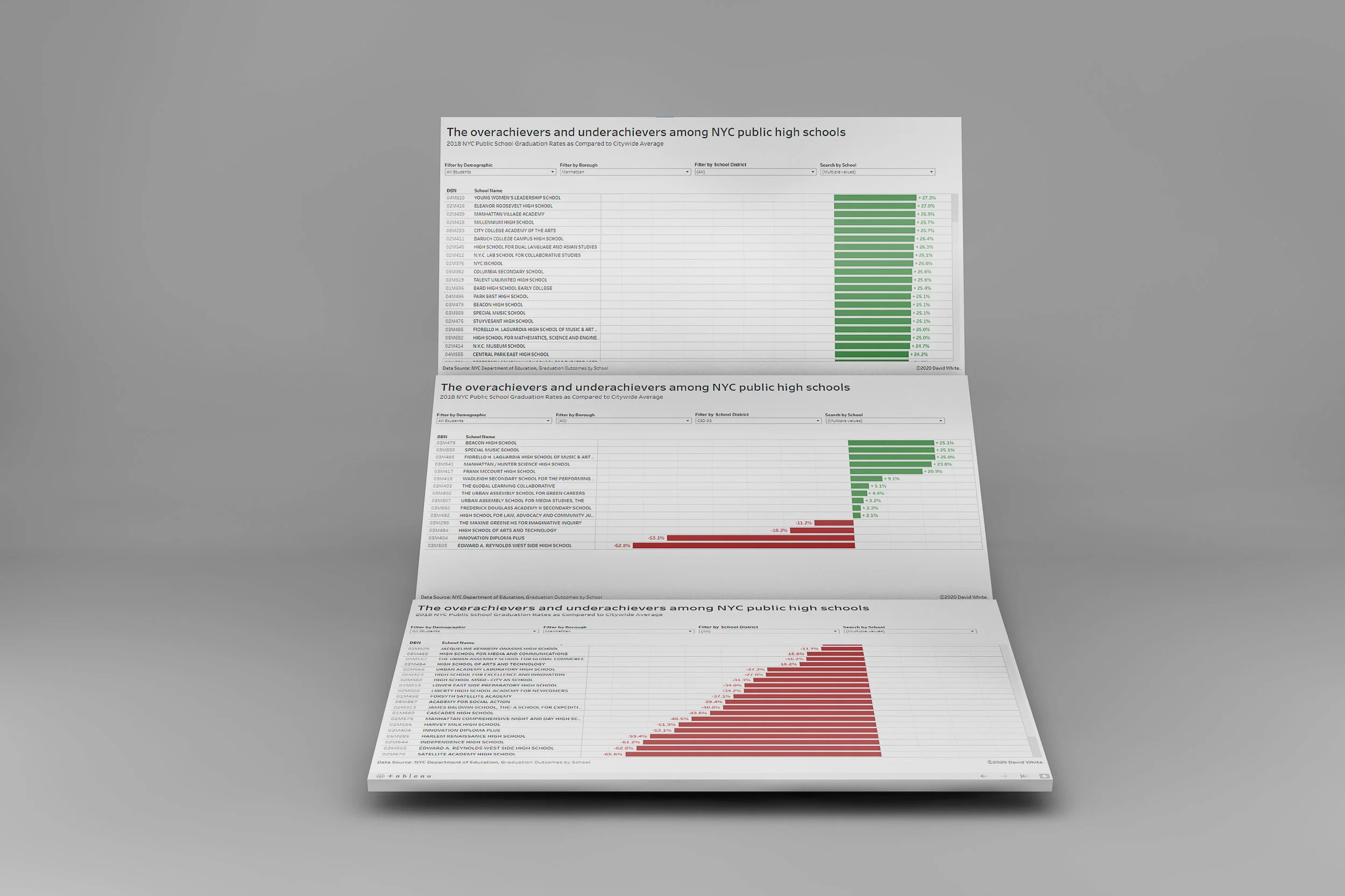
How NYC high schools measure up in comparison to their peers…Read more
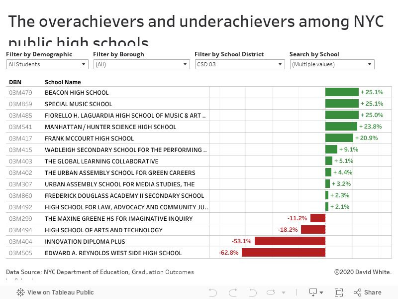
Insights, Made Fresh Daily
Standing Out
How NYC high schools measure up in comparison to their peers
David White | Saturday, July 3, 2021
This bar graph shows the graduation rates of NYC high schools in 2018 and how much each school’s graduation rate deviated from the citywide average. The interactive data graphic is filterable by borough, school district and demographic subgroup. The underlying data was released by the City of New York.
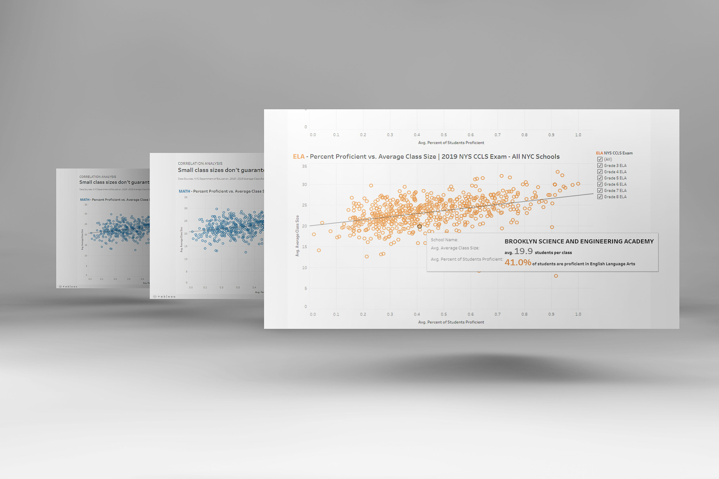
Friday, July 2, 2021
Counterintuitively, student-to-teacher ratios were not a reliable predictor of exam success…Read More
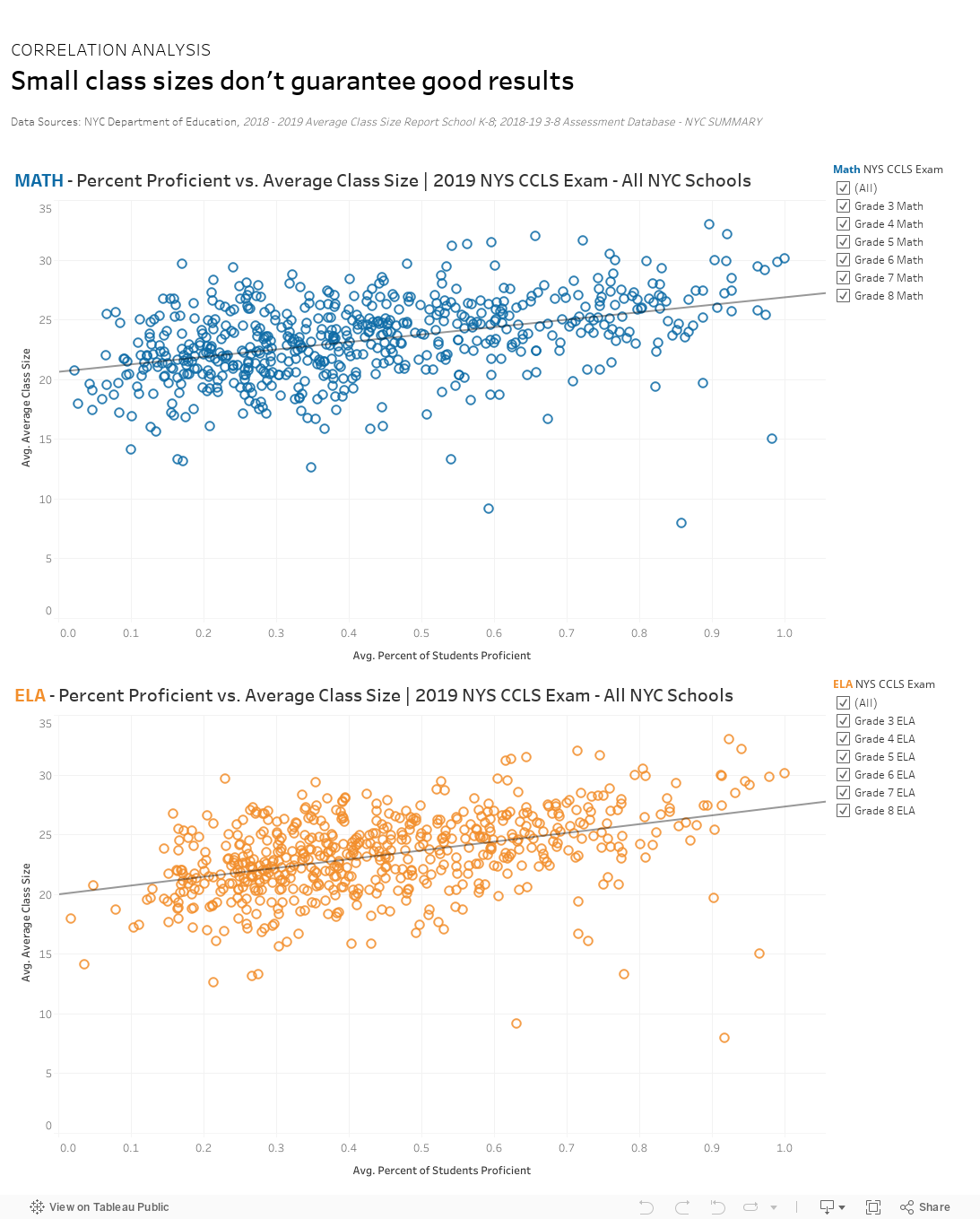
Insights, Made Fresh Daily
Some Unexpected Results
Counterintuitively, student-to-teacher ratios were not a reliable predictor of exam success
David White | Friday, July 2, 2021
This scatterplot shows the relationship between NYC schools’ average class size and their state exam results. The underlying data was released by the New York State Education Department (NYSED).
The data graphic shows the English Language Arts (ELA) and Math exam scores of New York City public school students in Grades 3–8. While there was a small amount of correlation between small class sizes and high exam marks, there were in fact many examples where schools with large class sizes earned high scores. Conversely, there were also several schools with small class sizes who did not perform as well as their peers.

Thursday, July 1, 2021
New York City’s high schools are producing more graduates In recent years…Read More
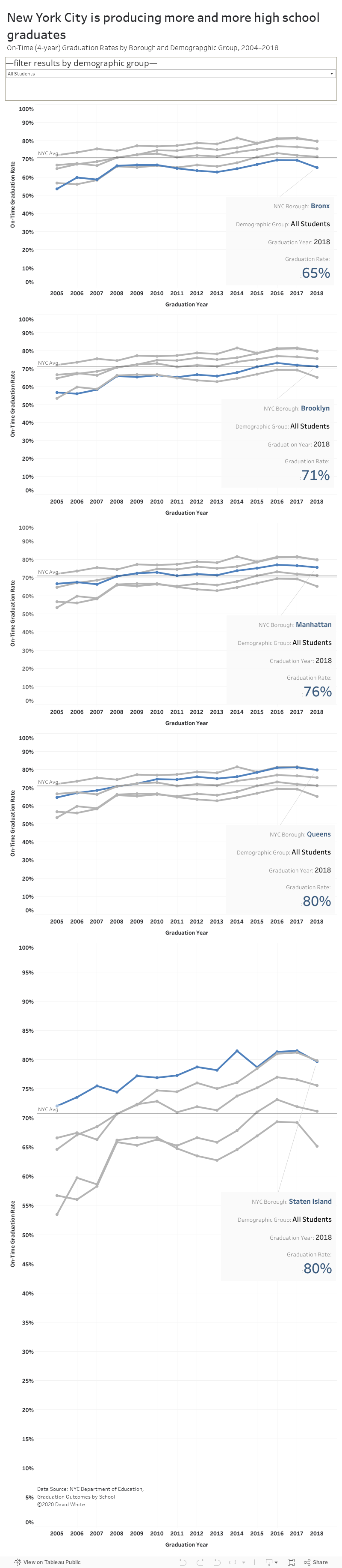
Insights, Made Fresh Daily
Upward Bound
New York City’s high schools are producing more graduates In recent years
David White | Thursday, July 1, 2021
This line graph illustrates the recent trends in NYC high school graduation rates. The underlying data was released by the City of New York.
The data graphic shows the graduation rates of New York City high school students between the years of 2004 and 2018. During that stretch of time, the average gradation rate citywide was 71%. Looking at the 14-year time period as a whole, the NYC graduation rates are trending upward.