cmd-019. a spreadsheet and a set of data graphics that track progress over time.
PROJECT COMPLETED: June 2021
THE STORY OF THIS PROJECT
Harlem Link Charter School is a tuition-free, independent charter school located in New York City. It serves 450 children in Pre-Kindergarten through Grade 5. Harlem Link is committed to equitable programming, inclusiveness and serving its entire community (Harlem and Washington Heights).
At Harlem Link, students who are enrolled in the English as a New Language program take a series of assessments throughout the school year to monitor the progress they’re making in English speaking, listening and writing. The asssmesnts produce a large volume of data that needs to be collected, crunched and reported on within a short window of time. In order to meet that challenge, I took the following steps:
I identified all of the locations where the data I needed to access was being stored.
I combined data from several different spreadsheets by using the IMPORTRANGE and VLOOKUP functions in Google Sheets.
I added context to the data I’d collected by using the IF, COUNTIFS and AVERAGE formulas to create additional columns of information.
I calculated summary statistics by using pivot tables.
I used the pivot tables I’d created to produce data visualiztions for the final data presentation.
The result was a spreadsheet and accompanying set of data graphics that were used to present data to teachers and school leaders at data meetings that were held once a semester. The document I produced gathered all relevant information and presented it in an easy-to-understand format. Also, since the document was based in the cloud, all stakeholders could review the data prior to the meeting and arrive prepared to contribute to the group discussion.
cmd-018. a cloud-based spreadsheet that helps stakeholders conduct collaborative data meetings.
PROJECT COMPLETED: June 2021
THE STORY OF THIS PROJECT
Harlem Link Charter School is a tuition-free, independent charter school located in New York City. It serves 450 children in Pre-Kindergarten through Grade 5. Harlem Link is committed to equitable programming, inclusiveness and serving its entire community (Harlem and Washington Heights).
At Harlem Link, students take grade-wide math exams roughly every six weeks. Teachers and school leaders then meet to review the results of the exams and discuss ways to improve. The exams produce a large volume of data that needs to be collected, crunched and reported on within a short window of time. In order to meet that challenge, I took the following steps:
I identified all of the locations where the data I needed to access was being stored.
I combined data from several different spreadsheets by using the IMPORTRANGE and VLOOKUP functions in Google Sheets.
I applied conditional formatting to make the spreadsheet more understandable at a glance.
I calculated summary statistics by using pivot tables.
I used the pivot tables I’d created to produce data visualizations for the final data presentation.
The result was a spreadsheet and accompanying set of data graphics (which I named the “Consolidated Tracker”). The Consolidated Tracker was then used to present data to teachers and school leaders. The document I produced gathered all relevant information and presented it in an easy-to-understand format. Also, since the document was based in the cloud, all stakeholders could review the data prior to the meeting and arrive prepared to contribute to the group discussion.
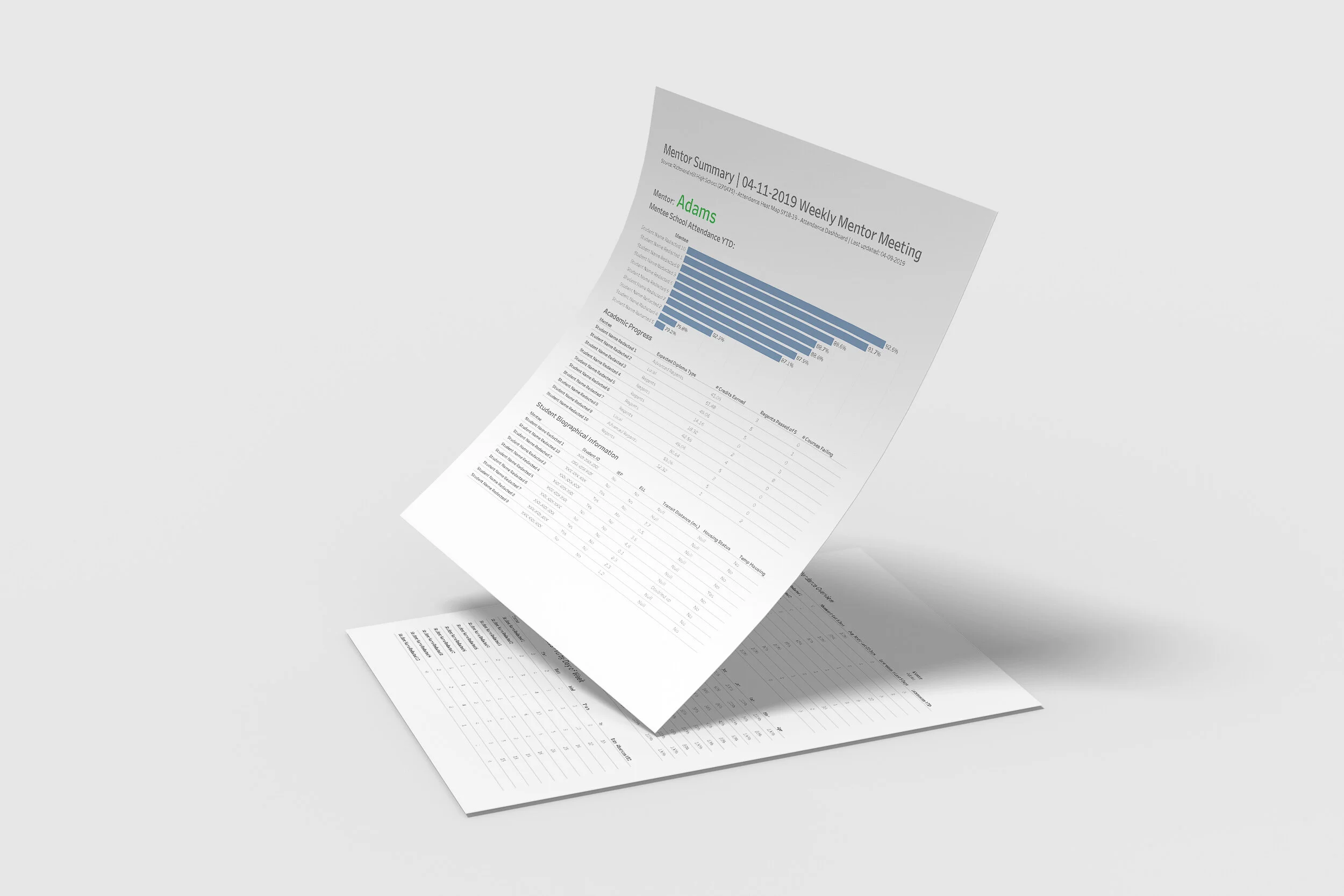
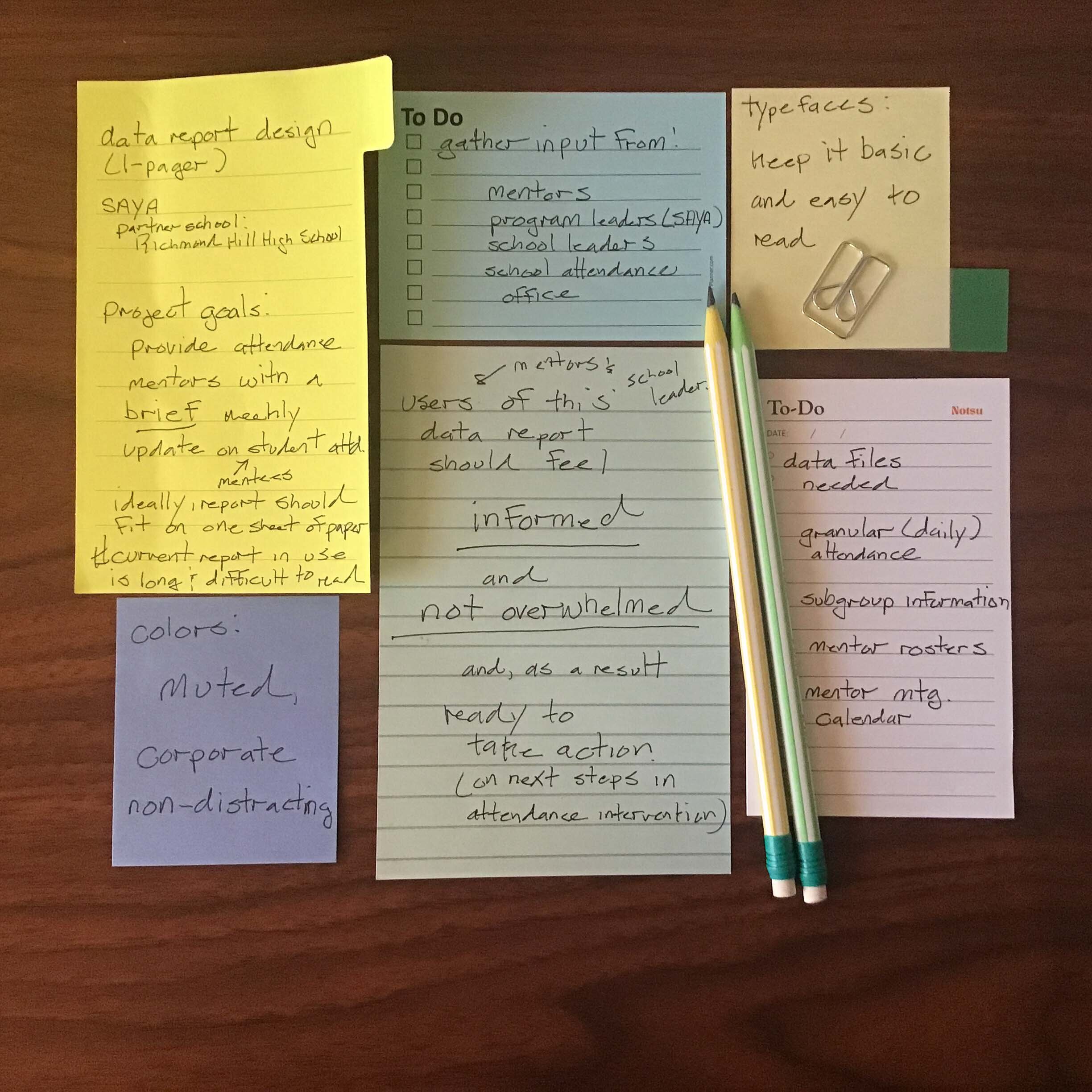
cmd-011. a concise weekly report that shows progress toward goals for a youth mentorship program.
PROJECT COMPLETED: May 2019
THE STORY OF THIS PROJECT
STAKEHOLDER’S PROBLEM: “Our team needs timely, relevant and straight-to-the-point reports that contain actionable information.”
South Asian Youth Action (SAYA) is a 501(c)3 youth development organization based in Queens, NY. SAYA’s mission is to foster a strong sense of belonging in youth and provide them with tools to thrive academically, professionally and personally. It currently serves more than 1,500 kindergarten through college-aged youths throughout the City of New York.
As part of NYC’s Community Schools Initiative, SAYA partnered with Richmond Hill High School to operate a mentorship program designed to target at-risk students to improve their school attendance and prevent dropouts. Each week, SAYA’s program administrators and the school’s staff members who were serving as mentors, met to review student data and collaborate on ways they could better support the students enrolled in the mentorship program.
When I first began attending the weekly team meetings, I saw that each week, mentors were being presented with a large amount of data delivered in a spreadsheet format. The data was very dense and difficult to read. Within this huge sea of data, it was rather difficult for each mentor to locate relevant information on the mentees in their individual caseload. To solve this problem, I designed and produced concise, individualized weekly data reports for each mentor working in the SAYA intervention program.
Work Process:
Here’s the design process I used to complete this project—