

cmd-022. a data analysis and presentation on targeting voters in a political campaign.
PROJECT COMPLETED: August 2021

Florida Congressional District 27 Voter Targets | Data Visualization by David White
THE STORY OF THIS PROJECT
I completed the Arena Academy in June 2021. Arena Academy is a bootcamp-like training program for aspiring political campaign professionals. The program provides immersive, hands-on training in seven different tracks: Campaign Manager, Communications Director, Data Director, Digital Director, Finance Director, Organizer, or Organizing Director. I completed the Data Director track.
As a capstone project, the participants are divided into teams comprised of one member from each of the seven tracks. The team is tasked with designing a winning strategy and presenting their campaign plan to a panel of expert judges. Our team was assigned a hypothetical challenger, running against against a real-world incumbent in Florida’s 27th Congressional District. I used simulated VAN voter file data to help develop our team’s finance, organizing, voter registration and turnout goals. For our final presentation, I created a data dashboard that illustrated our voter targeting strategy. (Following Arena Academy, I made further revisions to my dashboard based on the feedback our team received from the panel of judges.)
Here’s the design process I used to complete this project—


Final Results:


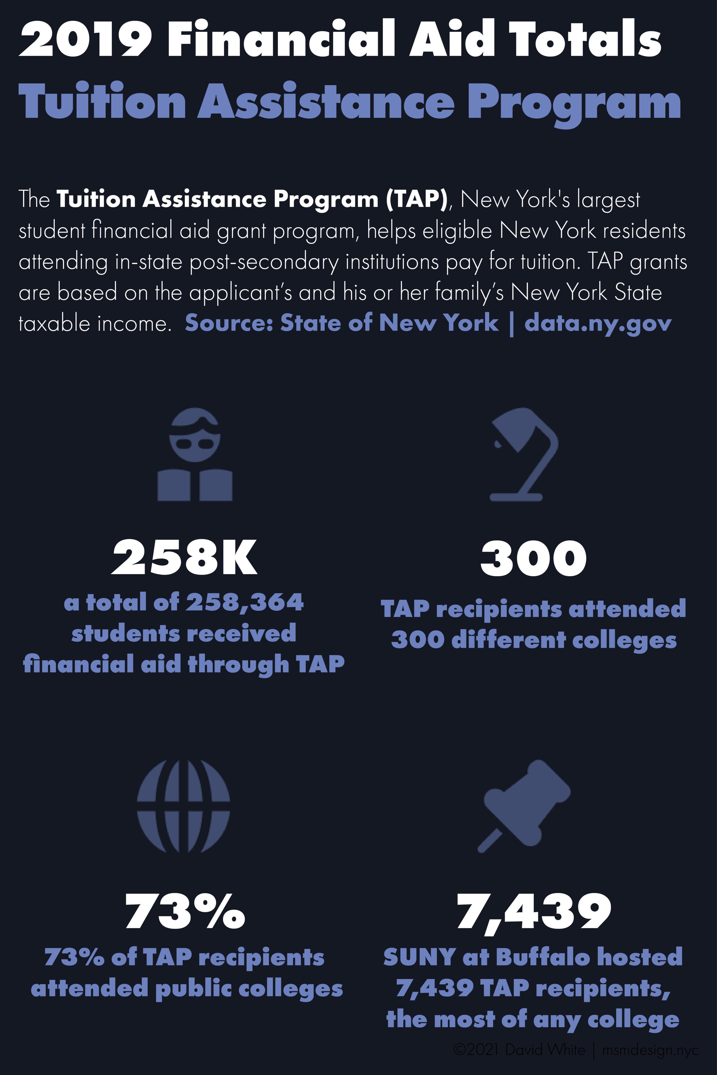
cmd-020. an infographic that briefly summarizes a large set of data.
PROJECT COMPLETED: July 2021
Infographics are simple data graphics that give a quick overview of a topic or set of information. Recently, I discovered a large dataset on student financial aid in the State of New York. I wanted to summarize the data and present it in the form of an infographic. Here are the steps I took to complete this self-directed project:


Final Results:

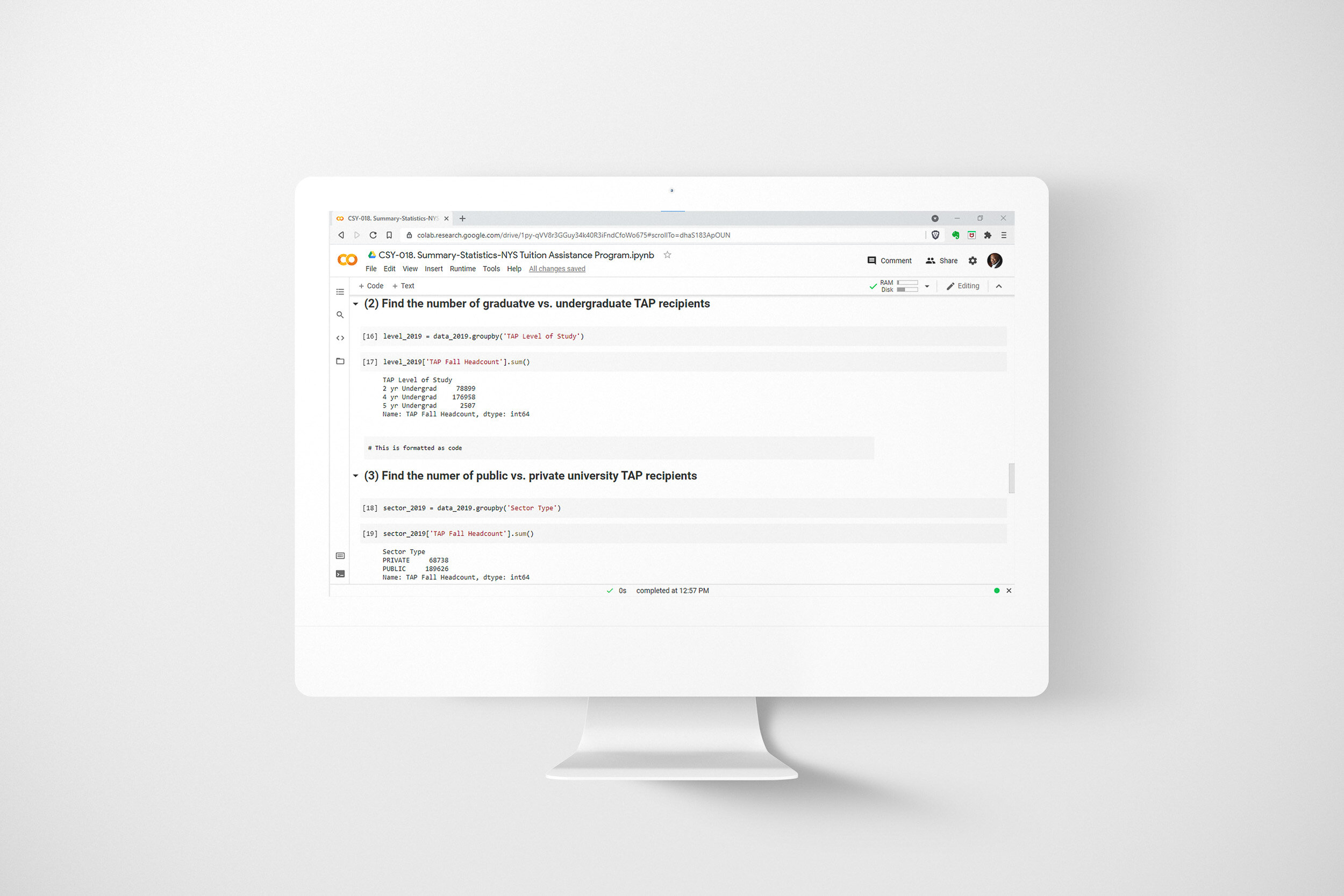
cmd-019. a spreadsheet and a set of data graphics that track progress over time.
PROJECT COMPLETED: June 2021
THE STORY OF THIS PROJECT
Harlem Link Charter School is a tuition-free, independent charter school located in New York City. It serves 450 children in Pre-Kindergarten through Grade 5. Harlem Link is committed to equitable programming, inclusiveness and serving its entire community (Harlem and Washington Heights).
At Harlem Link, students who are enrolled in the English as a New Language program take a series of assessments throughout the school year to monitor the progress they’re making in English speaking, listening and writing. The asssmesnts produce a large volume of data that needs to be collected, crunched and reported on within a short window of time. In order to meet that challenge, I took the following steps:
I identified all of the locations where the data I needed to access was being stored.
I combined data from several different spreadsheets by using the IMPORTRANGE and VLOOKUP functions in Google Sheets.
I added context to the data I’d collected by using the IF, COUNTIFS and AVERAGE formulas to create additional columns of information.
I calculated summary statistics by using pivot tables.
I used the pivot tables I’d created to produce data visualiztions for the final data presentation.
The result was a spreadsheet and accompanying set of data graphics that were used to present data to teachers and school leaders at data meetings that were held once a semester. The document I produced gathered all relevant information and presented it in an easy-to-understand format. Also, since the document was based in the cloud, all stakeholders could review the data prior to the meeting and arrive prepared to contribute to the group discussion.
cmd-018. a cloud-based spreadsheet that helps stakeholders conduct collaborative data meetings.
PROJECT COMPLETED: June 2021
THE STORY OF THIS PROJECT
Harlem Link Charter School is a tuition-free, independent charter school located in New York City. It serves 450 children in Pre-Kindergarten through Grade 5. Harlem Link is committed to equitable programming, inclusiveness and serving its entire community (Harlem and Washington Heights).
At Harlem Link, students take grade-wide math exams roughly every six weeks. Teachers and school leaders then meet to review the results of the exams and discuss ways to improve. The exams produce a large volume of data that needs to be collected, crunched and reported on within a short window of time. In order to meet that challenge, I took the following steps:
I identified all of the locations where the data I needed to access was being stored.
I combined data from several different spreadsheets by using the IMPORTRANGE and VLOOKUP functions in Google Sheets.
I applied conditional formatting to make the spreadsheet more understandable at a glance.
I calculated summary statistics by using pivot tables.
I used the pivot tables I’d created to produce data visualizations for the final data presentation.
The result was a spreadsheet and accompanying set of data graphics (which I named the “Consolidated Tracker”). The Consolidated Tracker was then used to present data to teachers and school leaders. The document I produced gathered all relevant information and presented it in an easy-to-understand format. Also, since the document was based in the cloud, all stakeholders could review the data prior to the meeting and arrive prepared to contribute to the group discussion.

cmd-017. a suite of online dashboards that give all members of an organization access to actionable information.
PROJECT COMPLETED: February 2020
THE STORY OF THIS PROJECT
Stakeholder’s Problem: “We need a way to quickly compile, analyze and report on our school’s data.”
Harlem Link Charter School is a tuition-free, independent charter school located in New York City. It serves 450 children in Pre-Kindergarten through Grade 5. Harlem Link is committed to equitable programming, inclusiveness and serving all children in its community (Harlem and Washington Heights).
At Harlem Link, students take a series of assessments throughout the school year to monitor their academic progress. The assessments produce a large volume of data that needs to be collected, crunched and reported on within a short window of time. In order to meet that challenge, I took the following steps:


Final Results:
—HARLEM LINK DATA SUITE: ACADEMICS—

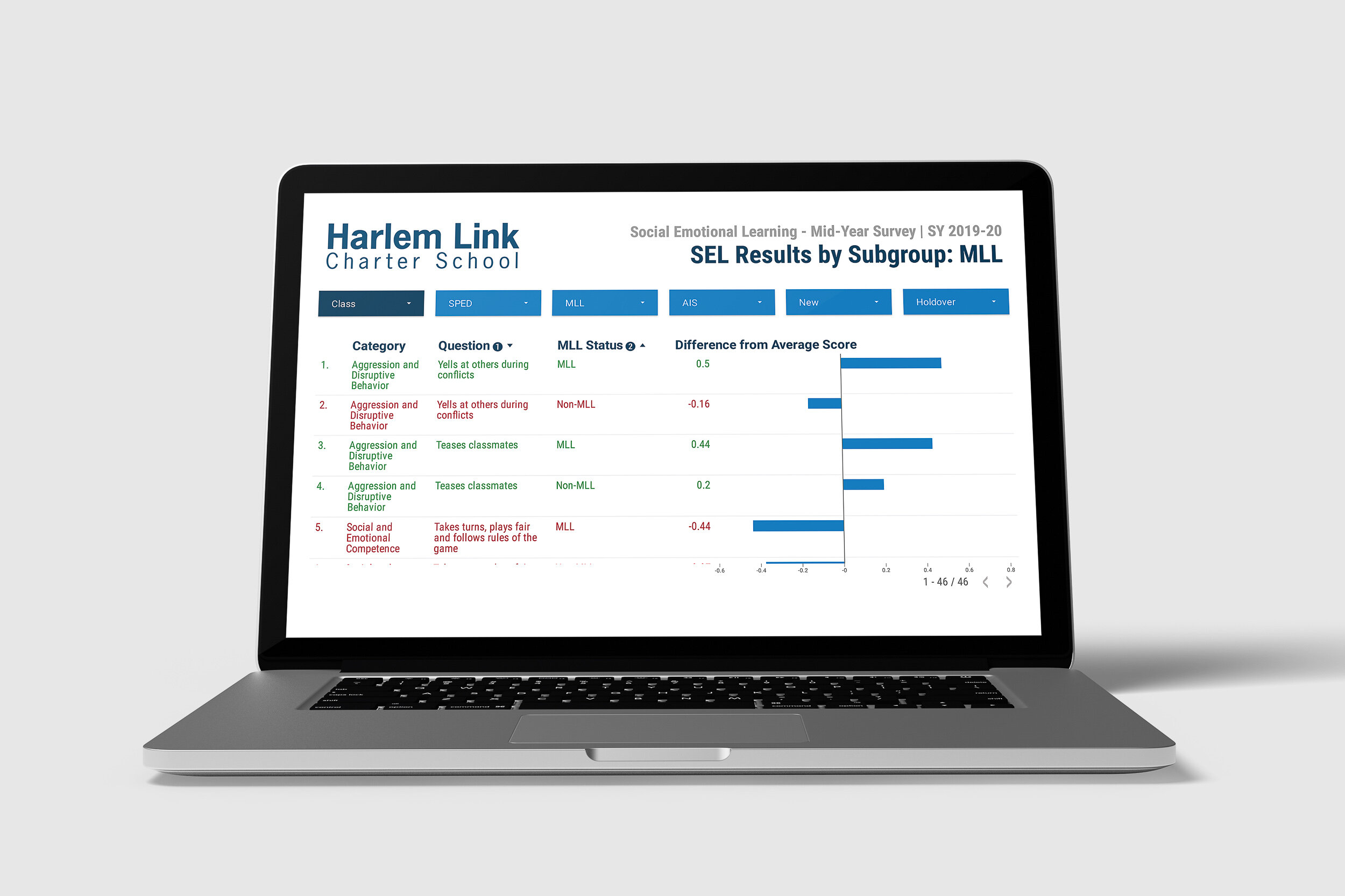
cmd-016. a data report that provides insight into the results of a recent survey.
PROJECT COMPLETED: December 2019
THE STORY OF THIS PROJECT
Stakeholder’s Problem: “We need a way to understand the results of our survey and communicate the insights we’ve gained.”
Harlem Link Charter School is a tuition-free, independent charter school located in New York City. It serves 450 children in Pre-Kindergarten through Grade 5. Harlem Link is committed to equitable programming, inclusiveness and serving all children in its community (Harlem and Washington Heights).
At Harlem Link, teachers fill out a detailed survey twice a year that assesses each of their students on several measures of their social and emotional learning. The surveys produce a large volume of data that needs to be collected, crunched and reported on within a short window of time. In order to meet that challenge, I took the following steps:


Final Results:

cmd-015. cloud-based data reports that put timely information at your fingertips.
PROJECT COMPLETED: October 2019
THE STORY OF THIS PROJECT
Stakeholder’s Problem: “We need a way to connect the data we have stored in various locations and assemble all of it into a usable form.”
Harlem Link Charter School is a tuition-free, independent charter school located in New York City. It serves 450 children in Pre-Kindergarten through Grade 5. Harlem Link is committed to equitable programming, inclusiveness and serving all children in its community (Harlem and Washington Heights).
The school’s normal daily operations produce a large volume of data that needs to be collected, crunched and reported on in real time. In order to meet that challenge, I took the following steps:


Final Results:
—HARLEM LINK DATA SUITE: OPERATIONS—


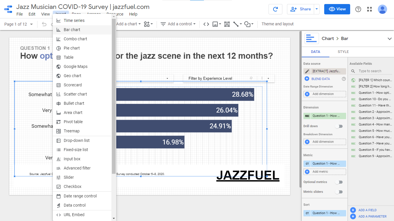
cmd-013. an interactive data visualization that communicates the results of a survey.
PROJECT COMPLETED: October 2020
THE STORY OF THIS PROJECT
Client’s Problem: “I recently completed a survey and now I need a way to analyze the results and share them with my audience.”
Jazzfuel.com is a professional development platform and online community that supports jazz artists in booking live performances, releasing recordings and promoting their work through traditional and social media.
In the fall of 2020, Matt Fripp, founder of jazzfuel.com, conducted a survey of the readers of his weekly newsletter to assess how the pandemic had impacted their livelihoods. He needed an analysis of the survey results and a user-friendly way to share that information. To solve these two problems, I designed and built an online interactive data visualization that communicated the findings of his survey.
Work Process:
Here’s the design process I used to complete this project—


Final Results:

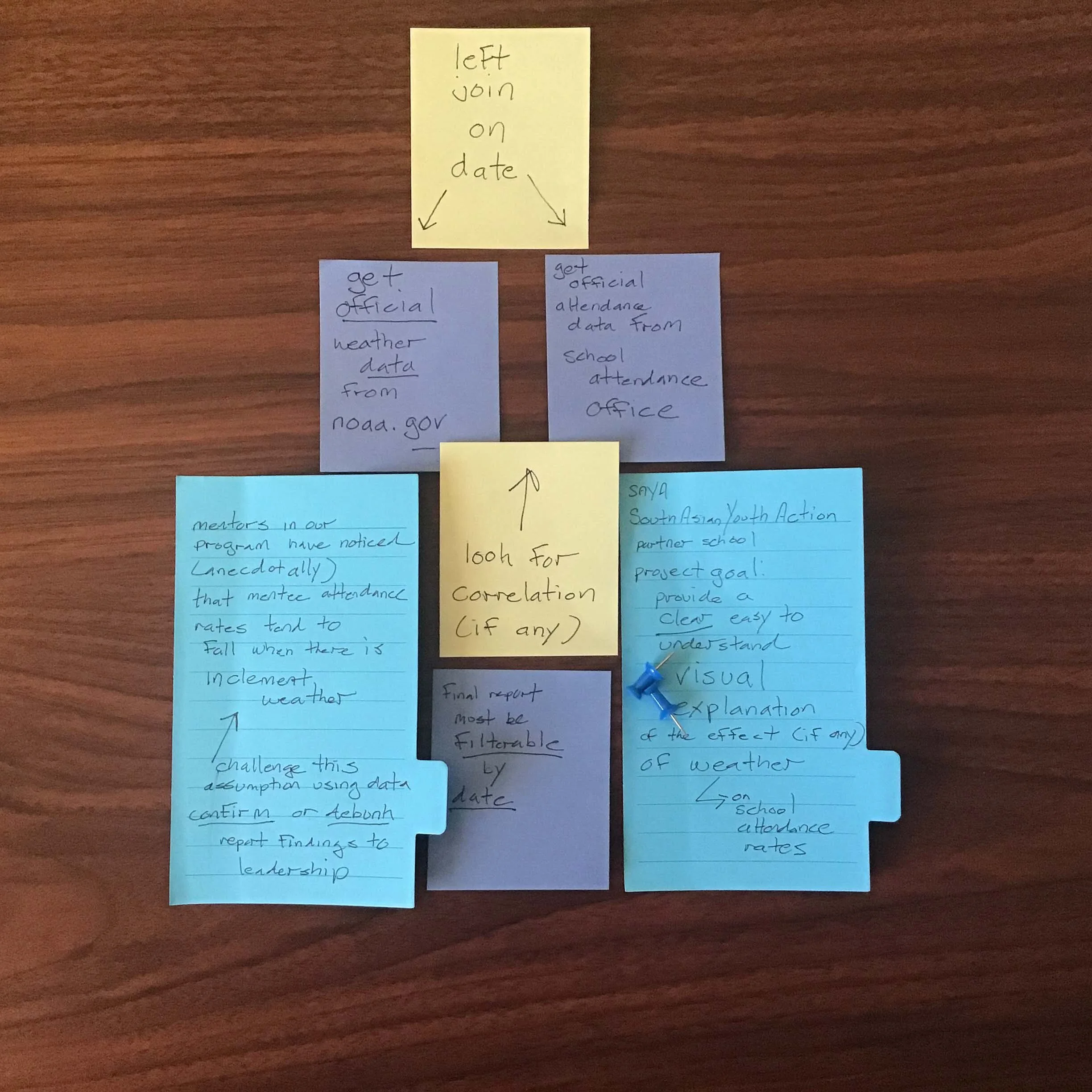
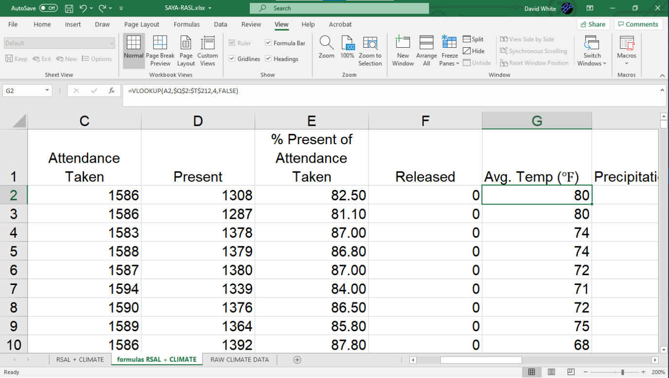
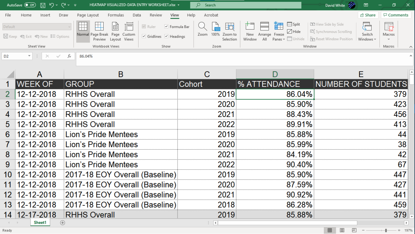
cmd-005. a visual that shows the effect that an external challenge is having on a nonprofit program.
PROJECT COMPLETED: April 2019
THE STORY OF THIS PROJECT
STAKEHOLDER’S PROBLEM: “We think we see something happening on the ground. We want to consult the data and have it either confirm our gut feeling or point us in the right direction.”
South Asian Youth Action (SAYA) is a 501(c)3 youth development organization based in Queens, NY. SAYA’s mission is to foster a strong sense of belonging in youth and provide them with tools to thrive academically, professionally and personally. It currently serves more than 1,500 kindergarten through college-aged youths throughout the City of New York.
As part of NYC’s Community Schools Initiative, SAYA partnered with Richmond Hill High School to operate a mentorship program designed to target at-risk students to improve their school attendance and prevent dropouts. Each week, SAYA’s program administrators and the school’s staff members who were serving as mentors, met to review student data and collaborate on ways they could better support the students enrolled in the mentorship program.
In the spring of 2019, the program’s mentors became concerned about the effect that weather was having on school attendance. They had anecdotal evidence that inclement weather or unseasonably warm temperatures were resulting in lower school attendance. However, they wanted a way to compare what they were witnessing individually to the overall data as a whole. To solve this problem, I designed and built an interactive data visualization that tracked the SAYA mentees’ school attendance against the weather conditions on each day school was in session.
Work Process:
Here’s the design process I used to complete this project—


Final Results:

cmd-004. a visual that illustrates the recent trends happening within a school's area of focus.
PROJECT COMPLETED: April 2019
THE STORY OF THIS PROJECT
STAKEHOLDER’S PROBLEM: “We need an accessible way to dive deep into our data and gain an understanding of what it’s trying to tell us.”
South Asian Youth Action (SAYA) is a 501(c)3 youth development organization based in Queens, NY. SAYA’s mission is to foster a strong sense of belonging in youth and provide them with tools to thrive academically, professionally and personally. It currently serves more than 1,500 kindergarten through college-aged youths throughout the City of New York.
As part of NYC’s Community Schools Initiative, SAYA partnered with Richmond Hill High School to operate a mentorship program designed to target at-risk students to improve their school attendance and prevent dropouts. Each week, SAYA’s program administrators and the school’s staff members who were serving as mentors, met to review student data and collaborate on ways they could better support the students enrolled in the mentorship program.
In the spring of 2019, the mentors began to notice some developments concerning the school attendance of their mentees. They wanted to drill down and further investigate these trends. They needed something that would assist them in gaining a better understanding of their data. To solve this problem, I designed and built a filterable, interactive data visualization that illustrated the recent trends in school attendance among the students enrolled in the SAYA intervention program.
Work Process:
Here’s the design process I used to complete this project—


Final Results:

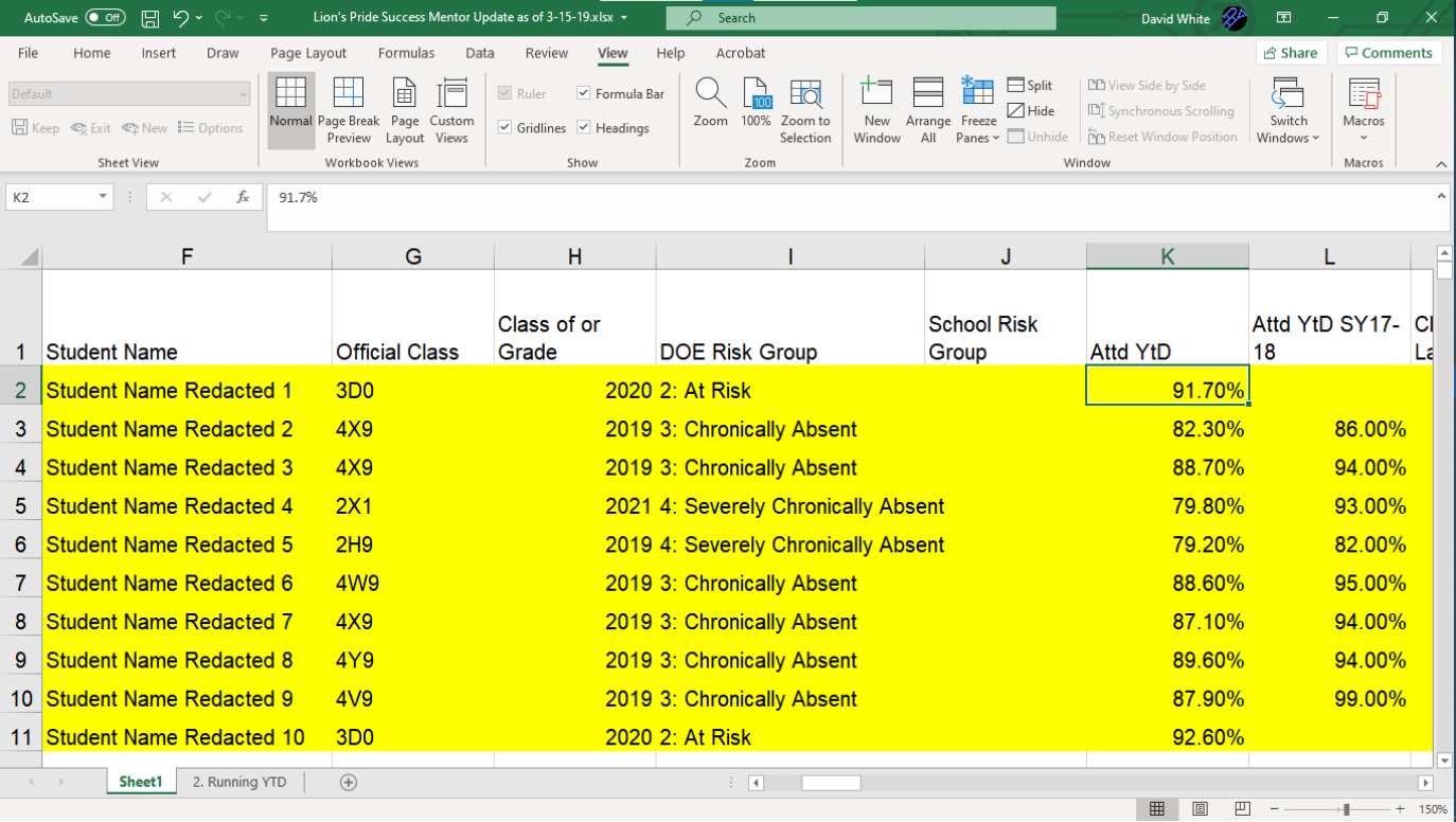
cmd-003. a visual that tracks the effectiveness of an intervention program for at-risk youth.
PROJECT COMPLETED: March 2019
THE STORY OF THIS PROJECT
STAKEHOLDER’S PROBLEM: “We need a simple way to monitor the effectiveness of our intervention program.”
South Asian Youth Action (SAYA) is a 501(c)3 youth development organization based in Queens, NY. SAYA’s mission is to foster a strong sense of belonging in youth and provide them with tools to thrive academically, professionally and personally. It currently serves more than 1,500 kindergarten through college-aged youths throughout the City of New York.
As part of NYC’s Community Schools Initiative, SAYA partnered with Richmond Hill High School to operate a mentorship program designed to target at-risk students to improve their school attendance and prevent dropouts. Each week, SAYA’s program administrators and the school’s staff members who were serving as mentors, met to review student data and collaborate on ways they could better support the students enrolled in the mentorship program.
When I began attending the weekly meetings, I saw that each week, mentors were being presented with a large amount of data delivered in a spreadsheet format. The data was very dense and difficult to read. From looking at the spreadsheet, it was very difficult for the mentors to discern exactly what the data was saying about their mentees. Also, since the data was granular (line-by-line) and not summarized, it was very difficult to compare the mentees to the overall student body or to examine subgroups of students within the mentorship program. To solve these problems, I designed and built a visualization, that was updated each week, that showed at a glance the current status and the weekly progress of the students in the SAYA intervention program.
Work Process:
Here’s the design process I used to complete this project—


Final Results:

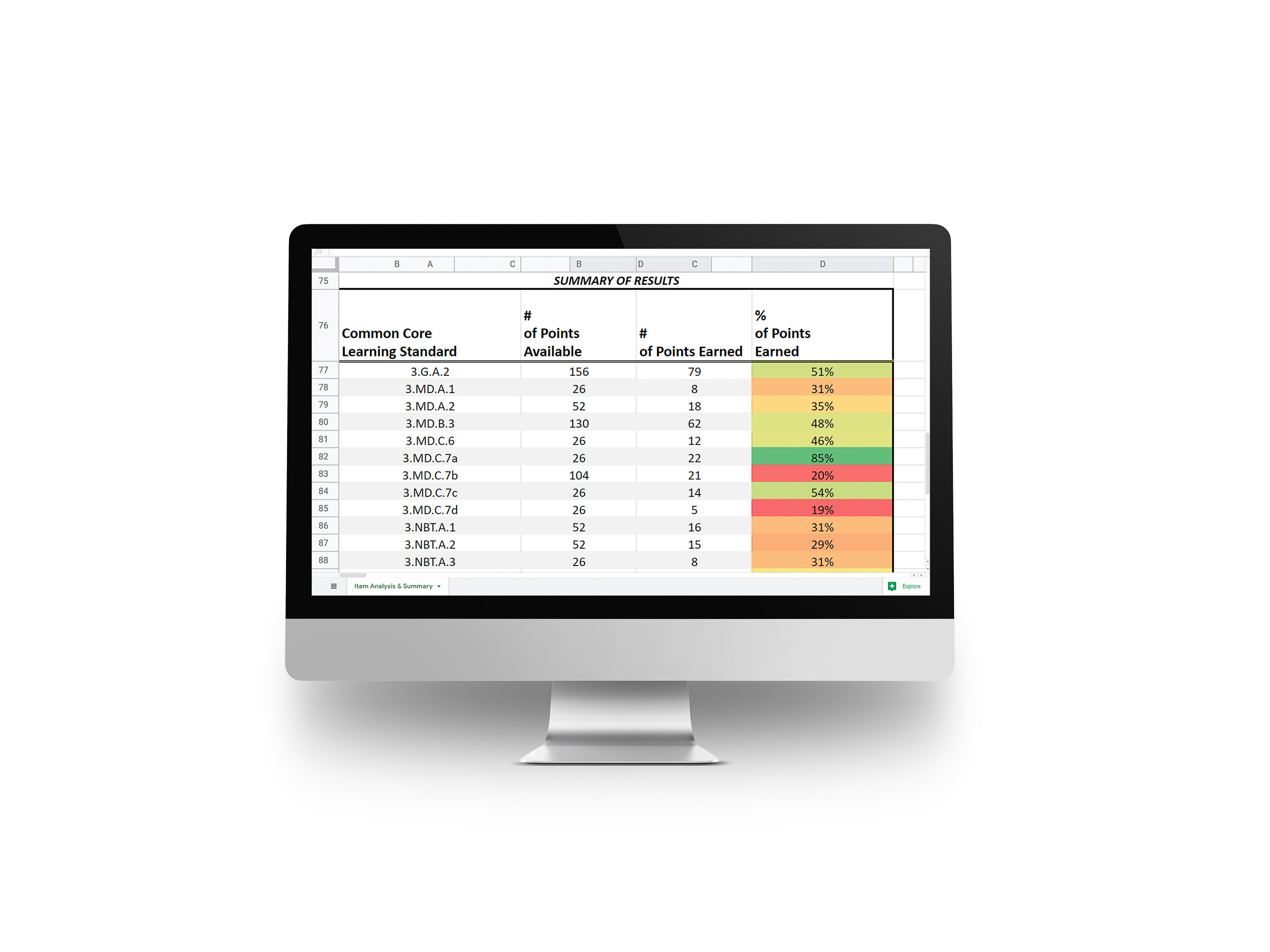
cmd-002. a data analysis tool that helps teachers deliver targeted instruction.
PROJECT COMPLETED: January 2016
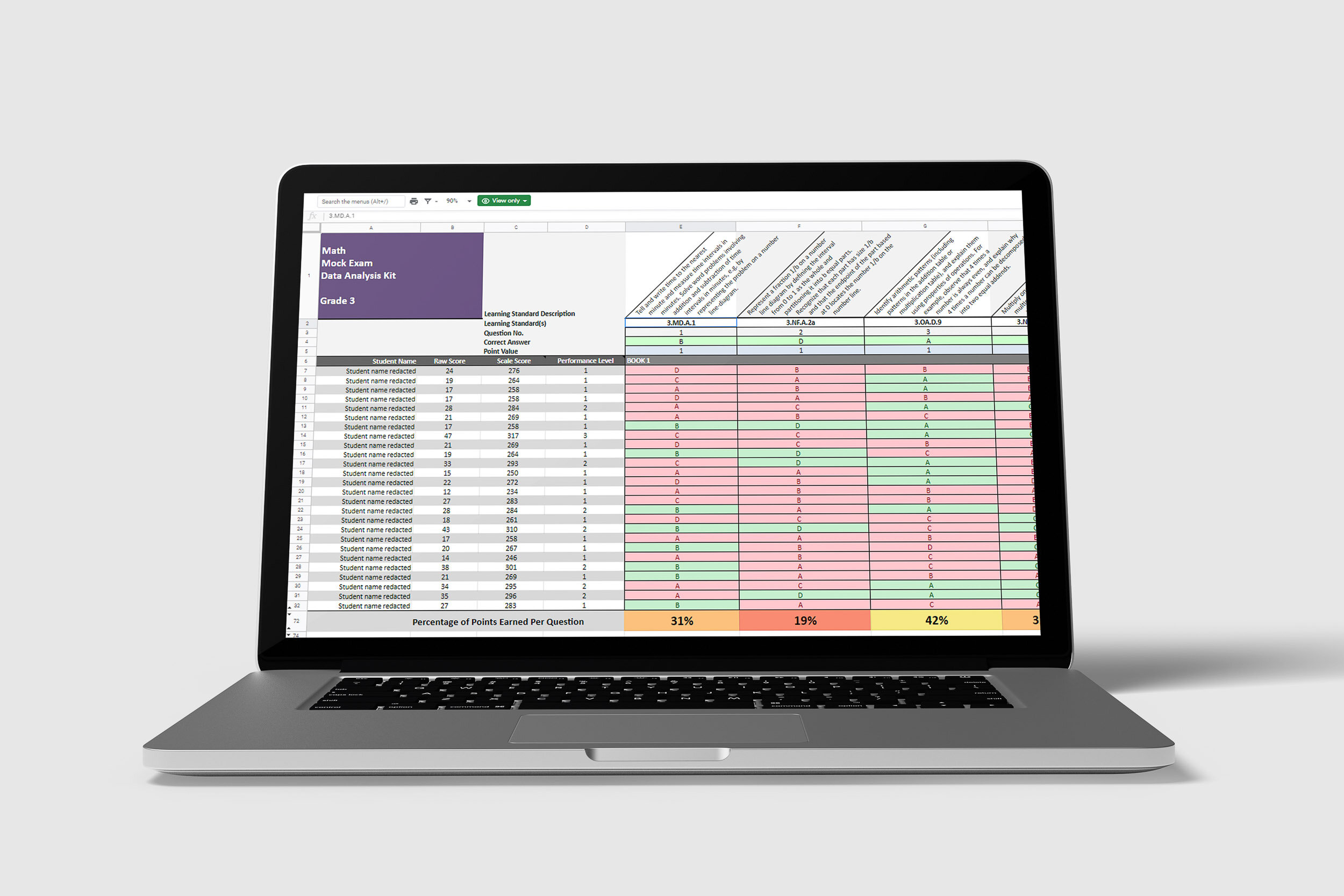
Global Community Charter School Data Analysis Kit | Spreadsheet by David White
THE STORY OF THIS PROJECT
Stakeholder’s Problem: “We need a way to quickly identify the areas where our students are strong and where they need more support.”
Global Community Charter School (GCCS) is a tuition-free, independent charter school located in New York City. It serves 400 children in Kindergarten through Grade 5. GCCS is committed to inclusiveness and serving all children in its community (Harlem and Washington Heights). The school employs a rigorous, inquiry-based model of education and it has been authorized by International Baccalaureate to offer the IB Primary Years Programme (PYP).
After giving students practice exams and other assessments, GCCS teachers needed to determine specifically what their students’ strengths and weaknesses were. After the tests, they knew that they may need to review or possibly re-teach certain topics. However, it was unclear exactly which topics needed to be reviewed and specifically which students needed extra help to master those skills. To solve this problem, I designed and built a data analysis kit for GCCS. The data tool I built helped teachers quickly identify which topics they needed to re-teach and specifically which students needed help where. The data analysis kit I built saved teachers’ time and it helped them deliver better, more targeted instruction.
Work Process:
Here’s the design process I used to complete this project—


Final Results:

Global Community Charter School Data Analysis Kit | Spreadsheet by David White
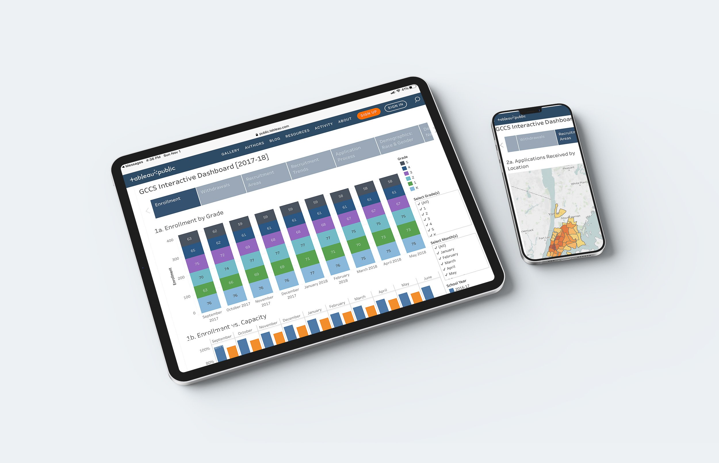
cmd-001. an online data dashboard for a nonprofit board of trustees.
PROJECT COMPLETED: February 2017
THE STORY OF THIS PROJECT
STAKEHOLDER’S PROBLEM: “We need an easy way to monitor progress and ensure accountability within our organization.”
Global Community Charter School (GCCS) is a tuition-free, independent charter school located in New York City. It serves 400 children in Kindergarten through Grade 5. GCCS is committed to inclusiveness and serving all children in its community (Harlem and Washington Heights). The school employs a rigorous, inquiry-based model of education and it has been authorized by International Baccalaureate to offer the IB Primary Years Programme (PYP).
In accordance with state law, GCCS is governed by a Board of Trustees that oversees the school’s operations to ensure fidelity to its educational mission, fiscal responsibility and compliance with all city, state and federal regulations. In order to accomplish this, the Board must review large volumes of data on a regular basis. To complicate matters, the Board of Trustees’ offices are not located inside the school building itself but rather Board members work off-site in different locations, in some cases, internationally. In order to monitor the school and ensure accountability, the Board of Trustees was in need of a consolidated, up-to-date, reliable and easy-to-use source of data that summarized the state of the school at a glance. To solve this problem, I designed and built an interactive online data dashboard for GCCS.
Work Process:
Here’s the design process I used to complete this project—


